 |
| Mort Head Design |
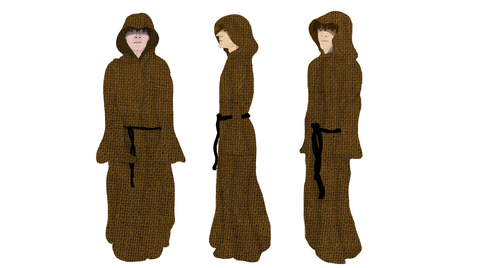
Because I knew the character would be wearing a hood and would do so throughout the entire animation, I designed the head with a hood on, as it gave me a better idea of how to shape the face and position the hair with a hood on. I'm actually really proud of my designs, as this is something I have never done before and I feel that he has the key characteristics of the character described in the book.
 |
| Final Character Design |
After I'd finally corrected my mistake of having no head, I went on to complete the rest of the design. I am really pleased with this design considering I was getting very frustrated with the process and I lacked the motivation to complete it, which has surprised me because I don't usually like work that I lack motivation in. I feel that this character design goes really well with the other character design, the style and the aesthetic are consistent and I feel that they will look good when placed next to each other.
No comments:
Post a Comment