Monday, 29 December 2014
Environmental Storytelling: Third Place
After thinking for a very long time I decided that the third place I would visit is Rivington. Depsite the fact that I have been to Rivington Pike there is a lot more to Rivington than just a Pike. The place I want to focus on the most is Lord Leverhulme's terraced gardens. I don't know much about the history of Lord Leverhulme so I'm not sure what to expect whilst I'm there other than crumbling buildings (from what I heard from my grandma). Whilst there I will take a variety of materials from pens to watercolours and I will use a wide range of drawings surfaces such as brown paper, tissue paper, cartridge paper, etc.
Thursday, 18 December 2014
After Effects: Induction 1
For our first After Effects Induction we went through the basics of how to use the program such as which panel was for what and how to open and set up a new project etc. Having used After Effects previously for my Pixilation project I was confident enough to do this with ease but it was nice for the reminder. We then began to look into how to use this program for animation, which surprised me at first because I was completely unaware that After Effects could be used to create animations.
Like I said before this was really just a basic induction into After Effects so it was mostly a case of listening and taking notes. We went through how to open projects with presets for animation and all the useful shortcuts for animating a composition. I found this extremely useful and it will help me when I come to use After Effects next time around.
Towards the end of the session we went through key framing, in which you map out certain key frames along the timeline in order to make an object/ image move. From this we were asked to create a short animation using solid blocks.
Tuesday, 16 December 2014
The Classical Elements: Environment Concepts Continued
If I'm going to be honest, I haven't really had much experience when it comes to environmental concepts and I never know where to start or how to even begin to think about what kind of environment I want for my animation. But, like with anything else, I felt that researching visual references would be a good place to start. So I decided to go onto trusty Google and pick up images of trees from there (because I know I definitely want trees and a lake).
Using these images as a reference I then began to create an environment for my animation in Photoshop, as I am doing a digital animation. Although I'd already begun to think about environment, I feel that I was going about it the wrong way and I feel that this was a much more successful attempt, as I felt more prepared and had a much stronger sense of what I wanted to achieve.

After completing this environment I found that I was actually quite happy with how this had turned out on my first try and I feel that it is basic enough to use with the rest of my animation, as it doesn't draw any attention away from the main element of my animation. I also like how simple the background is and I feel that it wasn't too much work to complete either meaning I'd have more time to focus on actually animating. I think because of the time frame I have and because I am struggling with the water element within my animation I will leave my background as it is and create the others similar to this one.
I then wanted to experiment with placing my characters into the environment to see how they would work together.

I decided to experiment with my Earth character, as this is the character that I will have the most trouble with making it stand out. However, apart from the quick sketch being slightly too small, I feel that the character works well in this environment and that it stands out against the other similar elements around it.
Overall, I feel that I have a good idea of how to create my backgrounds. I just need to tidy them up a little and I can use them within my animation.
Using these images as a reference I then began to create an environment for my animation in Photoshop, as I am doing a digital animation. Although I'd already begun to think about environment, I feel that I was going about it the wrong way and I feel that this was a much more successful attempt, as I felt more prepared and had a much stronger sense of what I wanted to achieve.
After completing this environment I found that I was actually quite happy with how this had turned out on my first try and I feel that it is basic enough to use with the rest of my animation, as it doesn't draw any attention away from the main element of my animation. I also like how simple the background is and I feel that it wasn't too much work to complete either meaning I'd have more time to focus on actually animating. I think because of the time frame I have and because I am struggling with the water element within my animation I will leave my background as it is and create the others similar to this one.
I then wanted to experiment with placing my characters into the environment to see how they would work together.
I decided to experiment with my Earth character, as this is the character that I will have the most trouble with making it stand out. However, apart from the quick sketch being slightly too small, I feel that the character works well in this environment and that it stands out against the other similar elements around it.
Overall, I feel that I have a good idea of how to create my backgrounds. I just need to tidy them up a little and I can use them within my animation.
Monday, 15 December 2014
Observe, Explore and Consider: Environmental Storytelling
For over Christmas, we were given a new brief in which we are to explore and develop our environmental storytelling. As part of the study task we have to go and visit 2 places we are unfamiliar with and one we know well and produce 5-10 drawings between A3 and A4 using a variety of materials. We are also encouraged to create a number a thumbnail sketches in order to decide which angles I would like to create my 5-10 images from.
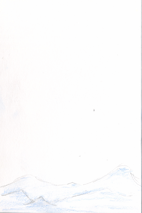
For the place that is familiar to me I feel that Newmillerdam would be a really good place to visit. I feel that I would be able to get some really nice landscape drawings and some really good perspectives from this area. Whilst here, I'd like to be able to experiment with drawing from different perspectives and trying to convey texture within my drawings through my line work and materials I use. I'd also really like to focus on the colour pallet. I think that the best way to approach an area this big when drawing from it would be to create a number of different thumbnail sketches and to also take photographs to refer back to when I'm no longer in that space alongside the drawings that I will produce whilst there. Also, because the location is so close to home this means that I will be able to take a wide range of materials, as I won't have far to travel. This opens up a window for experimentation.
For a place I am unfamiliar with I have decided to go visit the Wakefield Cathedral, as I realised that although I am familiar with Wakefield and the Cathedral's location I'm not actually familiar with interior of the place. In particular I am interested in the architecture of the building, as I REALLY like old buildings and the atmosphere within them. This is something I would like to experiment with creating within my images whilst there. I'd also really like to try and convey the vast space within the building so my focus will most probably be on my line work and trying to create tone and depth within my drawings whilst there. Because this is a public place and I don't know how long I will be allowed to stay there and draw, I feel that taking pictures to refer to later might be a good idea just in case I don't get the drawings I want whilst there. Also, I feel that I should limit my materials for drawing and break out of my comfort zone. I'm always using pencil, so to avoid using this I will leave all pencils at home forcing me to use other materials.
So far that is all I have and I will have to think on a third place to visit that is unfamiliar to me whilst I get on with my work.
The Classical Elements: Beginning to Animate
Reflecting upon my animation as a whole, I decided that I should begin with the water movement within my animation, as this is going to be the most difficult part of the whole thing, having never animated water before. At first I struggled to think of how to create a swirling column of water, as what I was trying to achieve went against the laws of physics and that made it really difficult to find any reference material to work from. But after watching a few Avatar episodes, I figured out how to create what I desired and I am quite pleased with the results. However, I have noticed that the water is very similar to that in Avatar and although I have used Avatar as a research point because I liked the colour choice and the style I should possibly try to make it a little more my own.
Once I had created the first 18 frames I realised that I was possibly too far zoomed in to the whole scene and had to zoom out. After overcoming my first little dilemma, I hit another one that is a lot more difficult. Now that I have my water column up in the air, I'm really struggling to figure out how to get my water column back down. I feel that looking at waterfalls and how they fall will help me to understand how to get my water to fall naturally.
This is proving to be extremely difficult.
Wednesday, 3 December 2014
The Classical Elements: Water Movement
In order to start getting my head around the movement of my water, I started to sketch out different ways in which I felt a water column would appear and found that this was proving to quite helpful, but, it wasn't helping me in terms of how I would actually get it to that stage. This was proving extremely difficult.

 |
| Water Drawings Tests |
So after drawing out a few I decided that I needed to find some visual reference of water moving in the style that I want for my animation. It took me a while but I remembered that Avatar:The Last Airbender wasn't just a film but also an animated series (and obviously one of the characters can bend water, so...). After researching Avatar: The Last Airbender, I finally got an understanding of how the water should move and decided to create a very small, short flip book to see how it would look.
 |
| GIF of my very short flip book. |
So I realise that it's a bit jumpy due to there being only 7 frames, but it gave me a really good idea of how it would look if I were to make my water move using this style. To test this more effectively I'll have to add more in between frames and work on spacing and timing.
Overall, I am pleased that I have finally figured this out and I can now begin to move forward with my animation.
Avatar: The Last Air Bender
Avatar: The Last Airbender is an animated TV series that follows the journey of young children that can manipulate and control the elements. Being a series I used to watch when I was younger it's been an influence to me for a very long time simply because it's an animation.
However, I feel that it has a lot of relevance to my project at the moment, particularly in the movement of water in unnatural ways. I really like the way that the water appears to have a lot of energy within this animation and the way that the lines are very simple yet effective. This is definitely something that I would like to capture within my animation, yet I am aware that I won't be able to create an animation of this quality at such an early stage, so I may not be able to create the exact same effect.
Not only do I like the water movement, I also like the overall style of the animation. I like the simple lines and the way that colour isn't overused. This has influenced me to think about the range of colours I use within my animation and to think about how too much or too little colour will effect how my animation is perceived.
Not only do these things appeal to me, but I feel that it provides a good example of how digital animation can be used in various ways, as it differs from the previous animations I have looked at, and it has reminded me that animations don't have to be realistic to be effective.
Tuesday, 2 December 2014
The Classical Elements: Research Into Animating Water
After having a talk with my tutor I realised that I didn't have much reference to work from regarding water movement. He recommended that I look at Elemental Magic, a book all about special effects animation, in order to get some visual reference for the movement of water and to kick start my research.


I found the section of the book on water quite useful not so much in terms of the movement of water in the way I want it, but it did give me some really good insight into the behaviours of water and how certain events such as splashing water (above), waves, etc could be animated.


I found the section of the book on water quite useful not so much in terms of the movement of water in the way I want it, but it did give me some really good insight into the behaviours of water and how certain events such as splashing water (above), waves, etc could be animated.
In particular I was very interested in how to animate waves, as these will play a part in my animation and will start off the main event within my story so I feel that this would be an important factor. The book mentions how water and nature aren't symmetrical, how it is us who look for symmetry in nature and often find symmetry where there isn't actually any. However, by using this non-symmetry rule it makes the waves and water look very realistic and it is something I don't really want, as I feel it will be too time consuming to animate nor do I feel that it would fit in with my characters. However, that doesn't mean the principle of animating waves isn't relevant.
I'm finding this book extremely useful and I feel that it is very good starting point to begin experimenting with animating my own water sequence.
Visual Language: Set, Series, Sequence Part 3
For the final part of this project, I had to create a series of 12 images that told a narrative of my 8 images. Obviously my narrative was going to be based on dragonflies. At first I was thinking "well done Emma, give yourself the hardest bug to focus on out of what you've drawn", and I didn't actually have any ideas whatsoever. GREAT! So I brainstormed, as usual, and realised that dragonflies actually don't appear to do much of anything, they just fly around. It's quite boring actually.

I finally hit a good one though, and it originated from the inspiration I gained from I book I had previously read, Phillip Pullman's, His Dark Materials Trilogy, better known as The Northern Lights. In this trilogy dragon flies are used as creatures of transport for otherworldly warriors. So that gave me the idea to have a narrative based on dragonflies being used as a form of transport.

Based on my developmental images I decided to add colour, as I felt that most of my coloured image was successful. I decided to create simple line drawings using fine liners, as I felt that this was the clearest of all my development images and this would make the drawings of my storyboard clear too and I felt that the colour helped to communicate the story a little better.
Overall, I have really enjoyed this project, as it has given me the chance to improve my quick response skills, which were lacking greatly apparently. I've also really enjoyed experimenting with different media, as I haven't done this for far too long and it has made me realise that I should keep up with experimentation regardless of how terrified I am of it going wrong.
I finally hit a good one though, and it originated from the inspiration I gained from I book I had previously read, Phillip Pullman's, His Dark Materials Trilogy, better known as The Northern Lights. In this trilogy dragon flies are used as creatures of transport for otherworldly warriors. So that gave me the idea to have a narrative based on dragonflies being used as a form of transport.
Based on my developmental images I decided to add colour, as I felt that most of my coloured image was successful. I decided to create simple line drawings using fine liners, as I felt that this was the clearest of all my development images and this would make the drawings of my storyboard clear too and I felt that the colour helped to communicate the story a little better.
Overall, I have really enjoyed this project, as it has given me the chance to improve my quick response skills, which were lacking greatly apparently. I've also really enjoyed experimenting with different media, as I haven't done this for far too long and it has made me realise that I should keep up with experimentation regardless of how terrified I am of it going wrong.
Monday, 1 December 2014
Visual Language: Set, Series, Sequence Part 2
For the second part of 'Set, Series, Sequence', I had to pick my most successful image and create a series of 8 images that develop upon my original image and focus on media, line, tone, etc. So after looking through all my images I decided to go with the dragonfly simply because I feel that it is the best one out of them all (it doesn't give me the creeps like the bugs do). I realised that many people may not actually see a dragonfly as a bug but more as an insect, but they're one and the same to me so...
Anyway.

Now that I had the freedom to experiment more with media and line, I really wanted to explore as much as I could with these so I tried to use a different line and media in each of my drawings. I also wanted to have a variation in the angles of my drawings so I also used a wide range of source photographs for this part of the project.
(1) For my first image I wanted to keep it quite simple in terms of not using too much media or line variation in one image, so I decided to use pencil and focus more on tone and mark making. I also wanted to break out from drawing A5, as I was getting quite tired of having to draw details so small, so I also focused on scale (I know A4 isn't much bigger but it worked). I really liked the tone I had created with the pencil and I was pretty surprised with my result as well, as I haven't used pencil like this in over a year. I realised just how much could be achieved with effective mark making. I also really liked how easy it was to create different line with the pencil, as this helped to portray the delicacy of the subject I was drawing.
(2) & (3) For these two drawings I wanted to focus on adding colour, as well as experimenting with line and mark making, so I used watercolours, as I am familiar with these. For the first drawing (2) I didn't want the colour to be part of the detail, more just a part of the image as a background, so I created a very quick wash of multiple colours that I could draw onto. I also decided that I wanted the drawings to be quite quickly done to match the background, so I used a fine liner and created 2 continuous line drawings. I find that this is a really effective drawing style, as I feel that it helps to portray the delicacy of the subject. I also just like the way it looks.
For the second drawing (3) I decided to do the opposite and have the colour be a part of the detail rather than just as a background. I also used a fine liner to add more delicate details that I couldn't achieve with the watercolours. Personally, I prefer the first drawing (2), as I feel that overall it more aesthetically pleasing and I don't feel that colour worked as well in the second drawing. I do however like the position of the second drawing. Perhaps it's look better at a larger scale.
(4) For this drawing I wanted to go back to tonal drawing, as the first was so successful, However, I wanted to try creating tone with a different medium, so I decided to used a fine liner with water, as I had no access to ink at the time. However, the paper I chose to do it on soaked up the water rather than letting it spread across the page, which resulted in my fine liner marks just looking blotchy rather than watered down. This was a really big shame, as I have done this technique before and I really like the result. This caused a problem for me so I let it dry and decided to do a detailed fine liner drawing instead. I really like the detail I was able to put into my image and the messy lines.
(5) Because I really liked the line that the fine liner made in image (2) it made me thing of other ink based materials that I could use and it lead me to experiment with Biro. Although I like it I feel that made the image a little too dark so there isn't much tonal range within the image. However, I did like using Biro and it is something I will try again but will focus on creating more of a tonal range next time.
(6) For this image I decided to attempt watercolours again, as I felt that I didn't use them as effectively as I could have last time. However, I decided to use just black rather than colour, as my tonal drawings were working well for me. I found that this attempt worked a lot better and I feel that I managed to get a lot more tone into this painting (the bottom wing's a bit dark though).
(7) For this drawing I returned to fine liner, as I wanted to focus purely on line. I really wanted to see how the weight of the line effected how 'heavy' the drawing appeared. I found that the thicker the line the 'heavier' the image seem and the thinner the line the 'lighter' the image. I feel that this really helps to depict which part of the subject is the most delicate and which is more substantial. I also really like the simplicity of the line and how clear the image is.
(8) For my final image I decided to go back to colour however, I didn't want there to be too much colour within my image so I decided to stick to using monochrome colours. Having not used coloured pencils for a very long time I was a little nervous about the outcome and I was worried that I wouldn't be able to create the different tones that I wanted. However, I am pleasantly surprised with the outcome. I really love how bold and strong the colours are and how well they are blended. The only downside to this medium is that it takes forever to colour just one small image.
Overall, I've really enjoyed doing this part of the project and I'm really pleased with each of my experiments. This has reminded me that I shouldn't shy away to experimenting with media, line, tone etc, as I could create some lovely work by doing so. It has also given me an insight into which materials I am strong with and which ones I need to improve on. I also feel that I should incorporate what I have learned through this task into my observational sketchbook.
Anyway.
Now that I had the freedom to experiment more with media and line, I really wanted to explore as much as I could with these so I tried to use a different line and media in each of my drawings. I also wanted to have a variation in the angles of my drawings so I also used a wide range of source photographs for this part of the project.
(1) For my first image I wanted to keep it quite simple in terms of not using too much media or line variation in one image, so I decided to use pencil and focus more on tone and mark making. I also wanted to break out from drawing A5, as I was getting quite tired of having to draw details so small, so I also focused on scale (I know A4 isn't much bigger but it worked). I really liked the tone I had created with the pencil and I was pretty surprised with my result as well, as I haven't used pencil like this in over a year. I realised just how much could be achieved with effective mark making. I also really liked how easy it was to create different line with the pencil, as this helped to portray the delicacy of the subject I was drawing.
(2) & (3) For these two drawings I wanted to focus on adding colour, as well as experimenting with line and mark making, so I used watercolours, as I am familiar with these. For the first drawing (2) I didn't want the colour to be part of the detail, more just a part of the image as a background, so I created a very quick wash of multiple colours that I could draw onto. I also decided that I wanted the drawings to be quite quickly done to match the background, so I used a fine liner and created 2 continuous line drawings. I find that this is a really effective drawing style, as I feel that it helps to portray the delicacy of the subject. I also just like the way it looks.
For the second drawing (3) I decided to do the opposite and have the colour be a part of the detail rather than just as a background. I also used a fine liner to add more delicate details that I couldn't achieve with the watercolours. Personally, I prefer the first drawing (2), as I feel that overall it more aesthetically pleasing and I don't feel that colour worked as well in the second drawing. I do however like the position of the second drawing. Perhaps it's look better at a larger scale.
(4) For this drawing I wanted to go back to tonal drawing, as the first was so successful, However, I wanted to try creating tone with a different medium, so I decided to used a fine liner with water, as I had no access to ink at the time. However, the paper I chose to do it on soaked up the water rather than letting it spread across the page, which resulted in my fine liner marks just looking blotchy rather than watered down. This was a really big shame, as I have done this technique before and I really like the result. This caused a problem for me so I let it dry and decided to do a detailed fine liner drawing instead. I really like the detail I was able to put into my image and the messy lines.
(5) Because I really liked the line that the fine liner made in image (2) it made me thing of other ink based materials that I could use and it lead me to experiment with Biro. Although I like it I feel that made the image a little too dark so there isn't much tonal range within the image. However, I did like using Biro and it is something I will try again but will focus on creating more of a tonal range next time.
(6) For this image I decided to attempt watercolours again, as I felt that I didn't use them as effectively as I could have last time. However, I decided to use just black rather than colour, as my tonal drawings were working well for me. I found that this attempt worked a lot better and I feel that I managed to get a lot more tone into this painting (the bottom wing's a bit dark though).
(7) For this drawing I returned to fine liner, as I wanted to focus purely on line. I really wanted to see how the weight of the line effected how 'heavy' the drawing appeared. I found that the thicker the line the 'heavier' the image seem and the thinner the line the 'lighter' the image. I feel that this really helps to depict which part of the subject is the most delicate and which is more substantial. I also really like the simplicity of the line and how clear the image is.
(8) For my final image I decided to go back to colour however, I didn't want there to be too much colour within my image so I decided to stick to using monochrome colours. Having not used coloured pencils for a very long time I was a little nervous about the outcome and I was worried that I wouldn't be able to create the different tones that I wanted. However, I am pleasantly surprised with the outcome. I really love how bold and strong the colours are and how well they are blended. The only downside to this medium is that it takes forever to colour just one small image.
Overall, I've really enjoyed doing this part of the project and I'm really pleased with each of my experiments. This has reminded me that I shouldn't shy away to experimenting with media, line, tone etc, as I could create some lovely work by doing so. It has also given me an insight into which materials I am strong with and which ones I need to improve on. I also feel that I should incorporate what I have learned through this task into my observational sketchbook.
Visual Language: Set, Series, Sequence Part 1
For the first part of this project, I was given a set of 9 words (dance, tank, science, flight, envelope, fork, bug, skip, plant) from which I had to choose ONE (I know it was a nightmare for me) to create a series of 32 A5 sketches from. After a very long think about which word to choose I managed to whittle it down to flight however, I noticed that most of the people around me were also doing flight and I didn't want my work to be influenced by theirs so it was back to square one. In the end I decided to do bug.
I must admit I found this task quite difficult, as I really struggled to come up with any form of quick response (in fact I struggled that much that it took me a week to create more than 4 images). However, after generating quick responses in the form of a brain storm, I did managed to finally come up with 32 images all depicting 'bug' in a different way and it didn't actually take me too long once I had the ideas. But, quick responses are something I am definitely going to have work on.
Now that I have my 32 different images I will have to pick out my most successful drawing and develop it further. This seems even more difficult than coming up with the first 32! Thinking about it now I'm feeling more fondness for my actual bugs, as I feel these will be easier to come up with a narrative for (so she says).
 |
| Gif of my 32 images. |
I must admit I found this task quite difficult, as I really struggled to come up with any form of quick response (in fact I struggled that much that it took me a week to create more than 4 images). However, after generating quick responses in the form of a brain storm, I did managed to finally come up with 32 images all depicting 'bug' in a different way and it didn't actually take me too long once I had the ideas. But, quick responses are something I am definitely going to have work on.
Now that I have my 32 different images I will have to pick out my most successful drawing and develop it further. This seems even more difficult than coming up with the first 32! Thinking about it now I'm feeling more fondness for my actual bugs, as I feel these will be easier to come up with a narrative for (so she says).
The Classical Elements: Character Development
Based on the feedback I received last week in my interim crit, I decided to experiment with adding texture to digital drawings of my characters. To do this I simply placed in a photograph of the element from Google on Photoshop and used different overlay settings until I found a balance between my drawing and the photograph that I liked. For my Earth character this was pretty straight forward, as I knew that I wanted her texture to be similar to tree bark. I feel that this character design is really successful and I don't feel that I will deviate much from this design at all.


For my water character though it was a lot more difficult, as there is many different textures to water depending on whether it's standing water, rushing water, etc. At the moment I'm leaning towards the second two designs because I really like the tone within them and I feel that the reflections from the light in the first character design are too bright.
After getting a couple of my peers' feedback, the second character design for water seems to be the most appropriate for my animation. Now that I have decided for definite that I will be using digital characters it's time to start creating my environment and experimenting with water movement, as this will be the biggest challenge of this animation.
Saturday, 29 November 2014
Windmills
Windmills is a short CGI animation created by The Windmill Team (a team of graduates of Georges Méliès School). I found this animation on YouTube whilst trying to found short animations based on the elements and I thought that the style of this animation was quite beautiful, in particular I really love the environmental aesthetics of the animation (not saying I don't like the story line of the animation because I do, I think it's great).
This has influenced me to look at experimenting texture in my environmental work for my animation. It has also made me think about colour pallets and the kind of textures I want within my animation. This animation has very rich, detailed environments, which I feel only helps to tell the story better. This is something I want to explore within my work and I should definitely figured out whether detailed, busy backgrounds will work for me or whether I should create very detailed characters instead.
Another small detail of this animation I like is the colours used for the water, especially the bubbles. Again this has influenced me to experiment with different colour pallets for my own water within my animation.
Overall. this animation has made me realise that I don't have to forfeit texture and detail just because I'm working digitally and I will explore and experiment with many different techniques throughout my work.
Tuesday, 25 November 2014
Alight by Jason Keyser
Alight is a short animated story of two elements who are in love but can't touch due to their nature. When i stumbled across this animation I was really pleased that I found an animation that contained the elements as characters and that were part of a fictional storyline, as other videos I had researched were all about the cycle of life or water but in a factual sense, which were offering me no kind of inspiration at all.
So, inspirational wise...
To begin with I really love the aesthetic of this little animation, in particular the aesthetic of the characters. If I'm going to get even more specific it's the way that Keyser has managed to create the texture on the water character. After my Interim Crit, this was something that was suggested I try to do and at first I was worried about how and if that was possible but now I know it is and that it can be achieved well, it has made me more determined to try it out.
Another thing that appealed to me about this animation is the simple design of the characters. After seeing this animation I have realised that my water character is quite similar to this one. It has made me think about ways in which I can make my water character posses the attribute of water a little more by thinking carefully about how water moves, and whether or not I should have my water character constantly morphing, similar to the water character in Alight.
ALSO, I really like the tones achieved using digital paint within this animation, which has inspired me to experiment more with my own digital work.
Visual Language: Sketchbook Update
For this brief we were given the task of keeping a sketchbook. This is so we can keep a general bank of visual inspiration. It is to be used as a visual diary to feed our future ideas and to also improve our general drawing skills and experiment with new materials and techniques. I really like the fact that we are being made to keep a sketchbook (or sketchbooks), as I feel it will help me to keep up with my drawing practice, particularly with me working on computers. A lot.
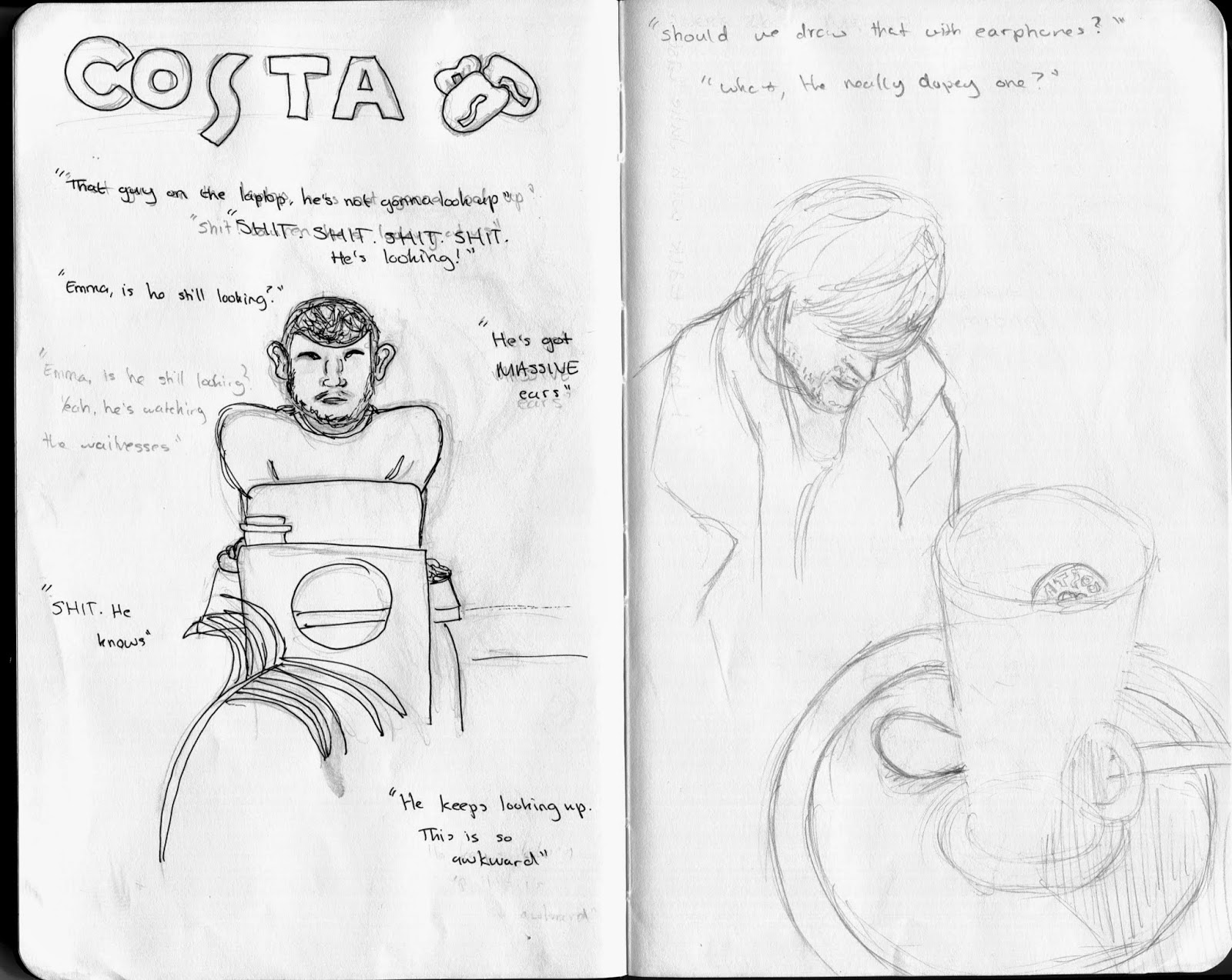
A lot of the drawings I have done so far have been observational, as I tend to draw mostly when commuting from uni to home (yes I am the creepy girl who sits there staring at you on your journey home). Although it takes me way out of my comfort zone to sit and watch people and then draw them without them noticing (which is difficult when your staring by the way) I'm really glad that I have to force myself into this situation, as it means I am limited to the amount of time I have to draw the person I have chosen. Whilst it is really frustrating that none of my drawings ever seem to really get finished, I feel that I am very slowly getting quicker at drawing and my line work is getting stronger, as I am becoming more confident in my own skill.
So far I've done a few pages and here they are. I'll keep you updated every now and then on my progress.


Monday, 24 November 2014
The Classical Elements: Interim Crit
Today's interim crit went really well, despite the fact that I was extremely nervous to the point where it kept me up for the majority of last night. I have always been terrible at public speaking and I made a major effort to push myself out of and beyond my comfort zone in order to do this presentation and I am very pleased with myself, as I felt I did a good job (if I say so myself).
In terms of feedback I feel that I received some really helpful constructive feedback that will help me to improve my overall story and animation. The feedback revolved around experimentation with combining animation methods such as drawn and digital and experimenting with combining media, in particular, watercolour and digital. I am pleased that my storyline was seen as a good idea and my character design was also good, however, the digital character was preferred over the other experiments, which I didn't feel was the strongest. Having said this, the points they made, made me realise that I could experiment with adding textures to the characters in Photoshop in order to create the desired look I want. I was really grateful for this advice, as I feel that this will make it easier to create if I like the style of it. My peers also approved of my audio choice and think that having natural sounds will work well with my animation.
I have taken a lot on from this feedback and I feel that the points made were very valid and were good suggestions for improvement. I will definitely experiment with more digital drawings and adding different textures to my drawings to see how this looks and how it affects the style of my animation. I will also experiment with combing both digital and watercolour to see how this also affects the animation.
Overall, I feel that it was a really successful discussion and I am pleased with the feedback I received for my work.
Sunday, 23 November 2014
The Classical Elements: Environment Concepts
Now that I have my very initial character designs down, I wanted to move on to experimenting with materials for environmental designs. Because I favour the watercolour character designs I naturally went in this direction for my first experiment. Although I really like the texture of the watercolours I wasn't sure whether this material was good for the background, as it seemed a little bold, however, this could be solved by using more diluted colours. I also experimented with coloured pencil, as I really liked the texture of the pencil when used for my character design.
Despite having only experimented with two different materials I don't feel as though I have any good ideas as to where to go with my environmental designs. Hopefully, tomorrow's interim crit will help to kick start some idea generation.
 |
| Watercolour |
 |
| Coloured Pencil |
The Classical Elements: Character Design - Earth
Again I experimented with the same materials but with slightly different outcomes in mind. Because Earth is a solid material I wanted the colours to be quite solid and so focused on trying to achieve this with the materials I had.
Surprisingly, I really like the effect of the watercolour and the texture it creates. I also feel that I managed to create quite a solid colour without it being too bold and bright, which is a good thing, as it will work in synchrony with the water character and not draw too much attention away from the other character. Another plus is that the material is really quick and easy to use, which will save me time when animating.
Again, I'm not a lover of the chalk pastels, as the colours are very strong and bold and they're very messy to use. However, again I love the texture, as I did with the last character and this material is something I will keep in the back of my mind and mention in my interim crit tomorrow.
The coloured pencil is another favourite of mine, as I really love the texture and the tones that I can create with them. Overall I can create much more tone and variation with the coloured pencils but this takes a lot more time. Because the animation is only going to be 20 seconds long, I will have to decide whether or not this much tone and detail is needed or whether I should tone down on the tonal detail to focuc on making a good background to match the tone of the characters.
Hmm, decisions, decisions...
 |
| Watercolour |
 |
| Chalk Pastels |
 |
| Coloured Pencil |
Hmm, decisions, decisions...
Friday, 21 November 2014
The Classical Elements: Character Design - Water
For my characters I wanted their appearance to reflect the appearance of the element they represented, as I feel that this would help to portray the story more coherently to an audience. Based on the brainstorms I did on colour themes and materials that would best portray the elements I decided to experiment with different materials as I drew the character out. However, I decided that I didn't want to try tissue paper, as I thought that this would take too long to create every single time. So I chose three materials and a digital method.
 |
| Watercolour |
 |
| Chalk Pastel |
 |
| Coloured Pencil |

Thursday, 20 November 2014
The Classical Elements: Mood Boards
Now that I have my idea down and I know which element(s) I want to focus on, I can start to design my characters. Although it seems pretty obvious what the element(s) I've chosen look like, I still thought it would be beneficial to create a mood board for them, as it will allow me to also look at texture, movement properties, etc. I feel that this will allow me to create a more accurate representation of the element(s) so it coneys the meaning more coherently to an audience.
I started off with water, as this is my main element of my animation and the main element behind my idea, as water is the source of life. I looked for images that would best depict the movement of water, as well as, its colours. But most importantly I really wanted to gather visual research for the different movements of water and how water looked whilst falling, rippling, rising, etc. I went over each image and wrote a few words to help trigger my memory on which aspect of the image I liked and found useful. I then did the same for Earth and again found some really useful images that I feel will really help to design an accurate character.
 |
| Water Mood Board |
 |
| Earth Mood Board |
Visual Language: Choosing a Sketchbook
For this project we are encouraged to use a wide range of media and materials including different sizes of sketchbooks. Having done a foundation course last year I have already worked in a wide range of sketchbooks and paper from A1 to A5 so I feel that I am confident drawing at different scales.
However, although I comfortable with drawing at all these scales, like anyone I do have particular sizes that I am fond of and that I will choose every time over other sized sketchbooks.

 |
| Really sorry for my bed being the backdrop... |
I really like the size and shape of these three sketchbooks in particular I love the small square sketchbook simply because once you've filled the sketchbook it's really fat and makes you feel like you've done a tonne of work. However, because I'll be carrying this sketchbook around with me everywhere and doing observational drawings I might want to think about how I am going to conceal the book and how having a very fat or large sketchbook is going to draw attention. Therefore, I have decided that for my observational and 'out and about' sketchbook I think the best book to use would be the A5-ish sized Moleskin, as it is easy to carry around and it's quite discrete. I also like it because it isn't too small so I should be able to get some nice line work in my drawings too.

The Classical Elements: Storyboarding Part 1
With this being my 4th storyboard, I knew that I needed to concentrate on using various camera angles and shots, which I tried to do but I still feel there's room for improvement. I feel that my initial storyboard portrays my idea quite well however, it could possibly use a few more drawings in the middle to really portray the idea of the movement of the water, but I will need to research water movement before I can draw this accurately.


Looking from a production pint of view, I feel that there is sufficient content to fill the 20 second time frame not including titles and credits. I also feel that there is plenty of demonstration of the 12 principles of animation within the animation. In order to estimate how long my animation was going to be and how long certain events will take within my animation I had to create an animatic from my initial storyboard. Having never made one of these before I didn't really know how to go about it so I simply loaded my thumbnails into Photoshop and created a timeline of my storyboard. From here I adjusted the amount of time I suspected each event to last in my animation in order to get an idea of how long I had for each event and to see how long my animation was expected to be. I'm pretty sure this isn't exactly how an animatic is made and when I research how to do them properly I'll conduct another one. But for now I feel that my animation is okay and the length of the story seems to be appropriate.
Now that I have got this basic animatic done I refined my storyboard and created a more refined animatic.
The Classical Elements: Generating Story Ideas
Before moving on to character design I feel that it is a good idea to come up with my story first, as it will reduce the amount of designing I have to do, as I can focus purely on the element I have chosen. At first I really struggled to come up with an suitable idea, they were all either too ambitious or no where near ambitious enough. It was frustrating. However, after sticking to it for a VERY LONG TIME, I did manage to come up with a few ideas that I felt had potential and then the tricky part came along of picking one and sticking to it.


After a lot of thinking (and a lot of tea) I finally managed to find an idea that I felt had plenty of potential and could possibly be developed upon if the story ended up being too short. So I decided to go for the base element of Water, linking it to the idea that water gives life and is a source of life to practically all living things. From here I wanted to introduce earth to represent Mother Nature, again as this is linked to life and creation, I thought it fit nicely. My idea is that these two elements come together to create a new life, my line of thinking here went to a little mud character (water + earth = mud. Right?). Now, at this point I wasn't really thinking about the time restriction, so I went off on a bit of tangent and began to think of how I could then carry the story on with this character. However, I did realise in the end and added those thoughts as possible developments.

Now that I have a basic idea I can begin the initial storyboards and animatics.
After a lot of thinking (and a lot of tea) I finally managed to find an idea that I felt had plenty of potential and could possibly be developed upon if the story ended up being too short. So I decided to go for the base element of Water, linking it to the idea that water gives life and is a source of life to practically all living things. From here I wanted to introduce earth to represent Mother Nature, again as this is linked to life and creation, I thought it fit nicely. My idea is that these two elements come together to create a new life, my line of thinking here went to a little mud character (water + earth = mud. Right?). Now, at this point I wasn't really thinking about the time restriction, so I went off on a bit of tangent and began to think of how I could then carry the story on with this character. However, I did realise in the end and added those thoughts as possible developments.
Now that I have a basic idea I can begin the initial storyboards and animatics.
The Classical Elements: Idea Generation Part 2
After researching each of the elements and thinking of possible character behaviours, I decided to think about character appearance, not particularly character design, but more to do with colours, possible materials and the best drawing style that would represent my chosen element the best, as this would play a big part in how the story is told and I brain stormed all the possible colour themes I could think of for each element.

This has given me a really good base to begin working from when I move onto my character design and development. When designing my characters I will experiment with different materials in order o find the right material to most effectively portray the behaviour, texture and movement of my chosen element.
Monday, 10 November 2014
Animation Skills: Reflection
Overall I really enjoyed this module and it
has taught me a lot about animation and the basics of how to become a
successful animator. It has also challenged me and pushed me out of my comfort
zone and put me under a lot of pressure, which I liked, as it has given me an
insight into how I react to pressure and tight deadlines. Throughout this
module I have learnt a lot about myself as an animator including both my
strengths and things I need to improve on.
Reflecting upon each of the tasks I have
completed throughout this module I feel confident that I can effectively
generate multiple ideas, from which I can then refine and develop upon one
particular idea. I also feel that I can effectively produce and refine a
storyboard that coherently portrays my ideas to people.
Another strength I have found through this
module is the capability to express anticipation really well in my work. I feel
my strongest example of this is the pose-to-pose experiment I conducted in
which I added character to my short animation. I also feel that another
principle of animation I have developed strongly over this module is my use of
arcs.
Finally, this module has also shown me that I
can cope quite well under pressure and tight deadlines. I have found that I can
plan my time effectively once I have an idea and I know what I want to achieve
for the given task.
Although this module has shown that I have
developed greatly as an animator over the short period of time I’ve been doing
it, there are still many things I need to improve on. For instance, regarding
the 12 principles of animation, I need to work on overlapping, timing and
spacing, and easing in and easing out. Whilst I have developed in these areas,
I feel that these could be improved on greatly and I will push myself to stress
these principles in Animation: Process and Production.
Time management is another thing I could
improve on. Although I am good at managing my time once I have an idea to run
with, I am quite bad at limiting the amount time I actually spend on coming up
with ideas. For the next projects I will be working on I will create a time
management sheet in which I can follow and I will push myself to finish certain
tasks within a particular time frame. Particularly I feel that Visual Language
will help me with this, as I have to focus on producing quick responses.
As a result of this module, I feel that I
should continue to improve on drawing skills. Despite the fact that I feel as
though I can draw it is important that I keep in practice with it in order to
keep my level of quality and to improve it. Again Visual Language will be
really helpful here.
Subscribe to:
Comments (Atom)