Wednesday, 22 April 2015
Applied Animation: Beginning to Animate
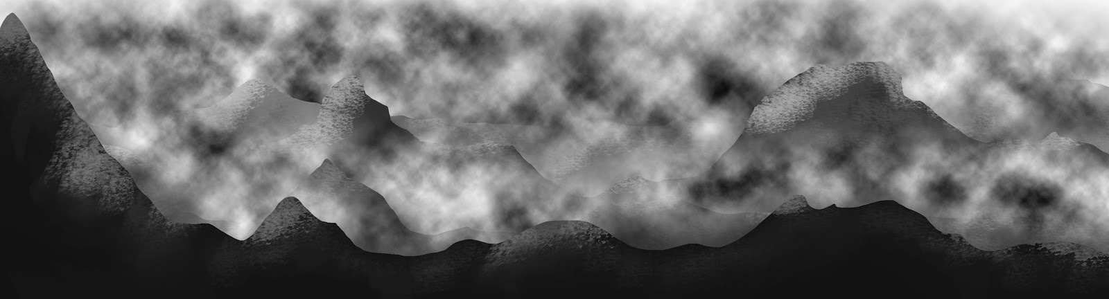
So the time finally arrived to begin animating for this brief. I decided to start off with the more simple parts in order to get them out of the way to give me more time to focus on the more difficult sections of the animation. To get me started I began with the mountains scene, as all I wanted to do with this scene was pan through it and use After Effects to create 3D layers to give the scene depth and to add to the atmosphere of the animation.
I feel that I have done a really good job of creating depth within this scene. I also feel that I have put all I have learnt of the programme so far into good practice and I am happy with this short clip and I feel that it conveys my ideas for this part of the animation really well. Having said that there are other elements I need to add to this scene before I will feel that it is fully complete such as, lighting and rain, but I do feel that I have a good solid foundation to work from here and I am pleased with my progress.
Applied Animation: Daniel Kanemoto's The Walking Dead
Before I begin to animate I thought I'd look at the title sequence of The Walking Dead created in After Effects by Daniel Kanemoto. I wanted to look at his work because I thought it would be really relevant to part of my own animation and I feel like I could benefit a lot from seeing other work that is similar to what I'm doing that has been created using the same programme as I am.
Although the theme and the content aren't all that similar, it was nice to see how effectively Kanemoto has been able to use the 3D cameras within After Effects and it has shown me exactly what can be achieved within After Effects if I were to spend quite some time on it, tweaking lighting, depth of field and camera focus.
I also like this animation because it demonstrates good scene transitions and good camera movement, which are also things I want to consider in my own animation. Overall, I really just wanted to watch this again to get a feel for what I could potentially create when using After Effects in my own work and give myself an inspiration boost.
Sunday, 19 April 2015
Applied Animation: Daredevil
Daredevil is a series that has just aired on Netflix this month and is also a series that I am enjoying. However, I'm not here to talk about why I the series so far, I wanted to talk about the opening sequence. Although it doesn't necessarily link to my title sequence, I like the way the sequence has been composited and I feel that it will benefit my own work if I were to look carefully at how this sequence has been put together because I feel that it switches from image to image very smoothly and effectively. With there being numerous scenes within my sequence, I feel as though I'd struggle with how to transition from one scene to the other smoothly, which would effectively make the sequence difficult to watch.
I'd really like to achieve a similar 'smoothness' to this within my own work and I feel that it could be achieved if I give myself enough time to composite all of my animated clips together.
Applied Animation: Environment Concepts - The Ramtop Mountains
Whilst drawing this environment I started to think about the detail within the whole composition and whether or not I wanted to include a lot of detail or very minimal detail. However, I couldn't make up my mind so I decided to create a very basic mountain range composition that could be used within After Effects to see if I liked the aesthetic but after seeing it completed I decided that it would fit in with the rest of my animation and decided that detail was a definite must-have.
 |
| Original design |
Improving upon the original design I decided to use a textured brush with the opacity reduced to create some detail and texture. I instantly saw an improvement after completing the first layer and decided that this technique would work well with the aesthetic of the whole animation. However, this left the 'sky' un-textured and looking odd. Referring back to the description of the environment in the book I realised that it was a very gloomy place where it constantly rains and has an unyielding storm floating through it. So I decided to use the cloud tool in Photoshop to add some storm clouds that I could stagger in After Effects.
 |
| Detail and texture |
The final image does look a bit crowded, but I have to remember that it will look different in After Effects, as the layers will staggered. Luckily each cloud and mountain range are on a separate layer, so it will be easy to remove a layer if I am not happy with it or if I feel that the composition is still over crowded when I come to animating it.
 |
| With clouds |
Thursday, 16 April 2015
Applied Animation: The Space Bit
So it dawned on me today that I hadn't actually thought about the space scene within my animation that will literally appear for a second, if that. Nonetheless, it is still an environment that I had to design regardless of how long it will appear in my animation and that was okay because I thought it wouldn't take all that long and I don't have to create it in too much detail because it won't be there long enough for people to pick up on it. Yet, I still ended up creating quite a detailed space environment that I am really proud of.

This was my first attempt at doing anything like this and I think it looks pretty damn amazing (if I do say so myself). Enough of how proud I am of myself though. Whilst I was creating this environment I was thinking about how this environment was going to be used within my animation. This particular part of the animation occurs when Death looks through the hourglass and I thought it would look really great if I were to use After Effects for this, as I would be able to use 3D cameras and create that sense of depth and help to illustrate the fact that the character is looking through into a certain point in time and space. So I've created a number of layers within this composition ready for use in After Effects. All I need to create now is the turtle...
Applied Animation: Hall of Hourglasses Part 3
To be able to get started with animating and experimenting with rendering my first environment, I thought it would be wise to first complete all the shelves in the room. So I did. However, this was a very long task and it took a lot longer than I thought it would, which is stressing me out a little because I feel as though I have fallen behind, although I'm not actually sure if I have or not. But, with me being stressed about this particular part of the animation and other projects I have going on, I have decided that I will add in the hourglasses themselves when I render the environment, as I feel that this will be less complicated because I can simply design the hourglasses and add them as an extra layer, preventing me from having to erase endless lines for it to make sense to me.

So this is what I have so far of the first environment and I feel that it is a good enough representation for me to start animating in and creating the first scene.
I am going to have to render this at some point though.
So this is what I have so far of the first environment and I feel that it is a good enough representation for me to start animating in and creating the first scene.
I am going to have to render this at some point though.
Saturday, 11 April 2015
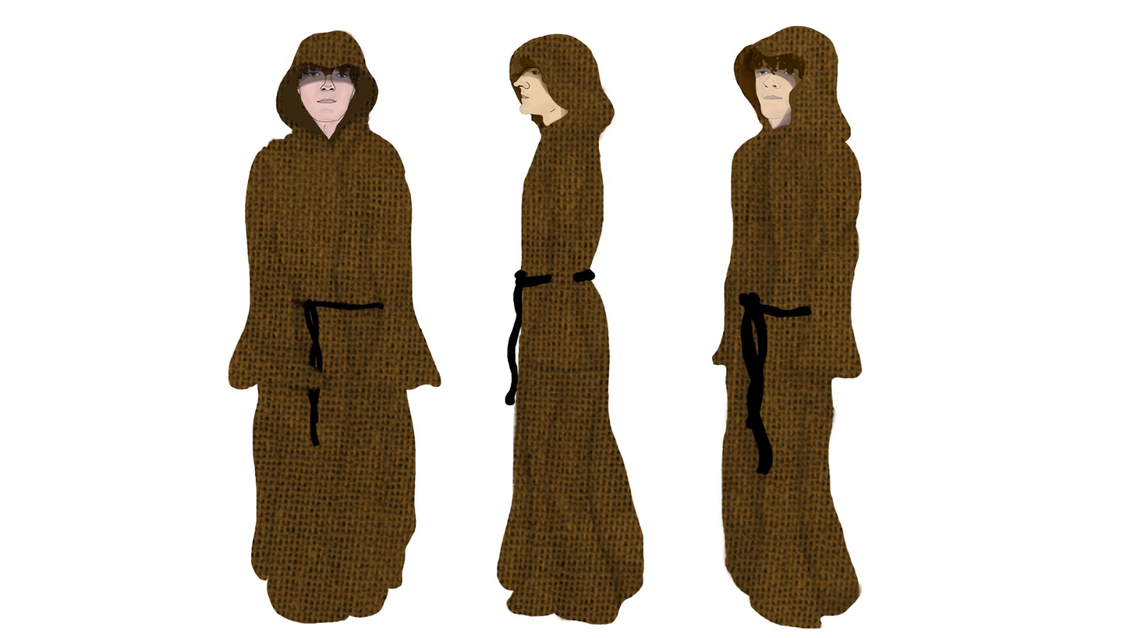
Applied Animation: Final Character Design - Mort
When it came to the final design I made the same mistake I did when designing the first character and forgot that the character would need a head. So I had to go back and design the head before I could do anything.
Because I knew the character would be wearing a hood and would do so throughout the entire animation, I designed the head with a hood on, as it gave me a better idea of how to shape the face and position the hair with a hood on. I'm actually really proud of my designs, as this is something I have never done before and I feel that he has the key characteristics of the character described in the book.
After I'd finally corrected my mistake of having no head, I went on to complete the rest of the design. I am really pleased with this design considering I was getting very frustrated with the process and I lacked the motivation to complete it, which has surprised me because I don't usually like work that I lack motivation in. I feel that this character design goes really well with the other character design, the style and the aesthetic are consistent and I feel that they will look good when placed next to each other.
 |
| Mort Head Design |
Because I knew the character would be wearing a hood and would do so throughout the entire animation, I designed the head with a hood on, as it gave me a better idea of how to shape the face and position the hair with a hood on. I'm actually really proud of my designs, as this is something I have never done before and I feel that he has the key characteristics of the character described in the book.
 |
| Final Character Design |
After I'd finally corrected my mistake of having no head, I went on to complete the rest of the design. I am really pleased with this design considering I was getting very frustrated with the process and I lacked the motivation to complete it, which has surprised me because I don't usually like work that I lack motivation in. I feel that this character design goes really well with the other character design, the style and the aesthetic are consistent and I feel that they will look good when placed next to each other.
Applied Animation: Character Concepts - Mort
After taking a break from character design (because I was getting slightly frustrated with it) I decided that I'd finally continue with it and get it finished so I wouldn't have to think about it anymore during this project. Because Mort wears similar clothes to Death in the book, Mort, it wasn't too difficult to come up with ideas for his clothes. However, I did really struggle with finding the motivation to do these concepts so I feel that I may have settled for the one I like because I'm tired of doing it. Having said that the design I have chosen works well for what I want it to be and I feel that in this case I am lucky, as I can get away with it.
Both designs are very similar however, I prefer the second design because it is a lot simpler, which reduces my work load. Plus Mort doesn't actually appear much in the first few pages so I feel that I can get away with a slightly less detailed design, as he won't be making much of an appearance. I also prefer the design with the hood, as it holds onto that sense of mystery, which I feel the book also contains.
 |
| Concept 1 |
 |
| Concept 2 |
Both designs are very similar however, I prefer the second design because it is a lot simpler, which reduces my work load. Plus Mort doesn't actually appear much in the first few pages so I feel that I can get away with a slightly less detailed design, as he won't be making much of an appearance. I also prefer the design with the hood, as it holds onto that sense of mystery, which I feel the book also contains.
Sunday, 5 April 2015
Applied Animation: Environment Concepts - Hall of Hourglasses Part 2
Based on the reference photographs I took the other day and the references I took from Harry Potter and the Order of the Phoenix I have been able to create a few different concepts of how I want the basics of the room to appear.
Although I was really pleased with myself for managing to get the perspective of the room looking okay and the lines more or less lined up, I wasn't actually happy with the overall appearance of the room. There isn't enough depth within the room and there aren't enough shelves either and whilst I could place more shelves within the room, I still don't feel that this would help to portray the vastness of the room like I would want it to. However, it has given me a good basis to help with the other room designs.
Because I wanted the room to look larger and feel more vast, I decided to experiment with changing the perspective and adding more shelves to the room. This did help to make the room look larger, like I had hoped it would. I also changed the design of the shelves a little so I wouldn't have to draw as much detail if I were to use this as my final design. I need to think about how much detail I want in my backgrounds, as it will effect my time management if there is a lot of small detail. I really liked this design and I was happy to leave it there, however, I decided to give myself one last shot at designing my Hall of Hourglasses just in case I came up with something better...
...and I did. I really like this last design. I feel that it captures the vastness of the room really well and helps to create an ominous atmosphere. I feel that it has the potential to be a space that will make an audience feel slightly on edge, as it could appear to be a room of mystery that has an edge of danger to it because it is so large. I also really love the camera angle in this design, as it also helps to create a sense of vastness and space. I also like the design of the shelves, as they aren't too complicated yet they look really good when they are put together in this way.
 |
| Concept 1 |
Although I was really pleased with myself for managing to get the perspective of the room looking okay and the lines more or less lined up, I wasn't actually happy with the overall appearance of the room. There isn't enough depth within the room and there aren't enough shelves either and whilst I could place more shelves within the room, I still don't feel that this would help to portray the vastness of the room like I would want it to. However, it has given me a good basis to help with the other room designs.
 |
| Concept 2 |
Because I wanted the room to look larger and feel more vast, I decided to experiment with changing the perspective and adding more shelves to the room. This did help to make the room look larger, like I had hoped it would. I also changed the design of the shelves a little so I wouldn't have to draw as much detail if I were to use this as my final design. I need to think about how much detail I want in my backgrounds, as it will effect my time management if there is a lot of small detail. I really liked this design and I was happy to leave it there, however, I decided to give myself one last shot at designing my Hall of Hourglasses just in case I came up with something better...
 |
| Concept 3 |
...and I did. I really like this last design. I feel that it captures the vastness of the room really well and helps to create an ominous atmosphere. I feel that it has the potential to be a space that will make an audience feel slightly on edge, as it could appear to be a room of mystery that has an edge of danger to it because it is so large. I also really love the camera angle in this design, as it also helps to create a sense of vastness and space. I also like the design of the shelves, as they aren't too complicated yet they look really good when they are put together in this way.
Overall, I feel that I have a room design that I am really happy with here and I feel that I will be able to work with this design really well. I also feel that it has the potential to be a really good room to move through. I just need to think about adding the hourglasses and colour now...
Friday, 3 April 2015
Applied Animation: Environment Concepts - Hall of Hourglasses Part 1
To get started, I decided that it may be a good idea to take my own photographs of rooms throughout my house that are similar to the ideas I have for this particular environment.
This has given me a good idea about perspective and it has also allowed me to experiment with different perspectives, so I get a better idea about which angle I would like to animate at and so on.


However, whilst they give me an idea of space and perspective, there is only one shelf, rather than two on either side, which makes it a little difficult to see how the room would appear from a 'straight on' view. So these might not be a helpful as I would have hoped. Having said this, combined with the refernces taken from Harry Potter I'm feeling confident that I will be able to create an environment that I am happy with.
This has given me a good idea about perspective and it has also allowed me to experiment with different perspectives, so I get a better idea about which angle I would like to animate at and so on.
 |
| Slightly to the side of the shelf |
 |
| Flush with the shelf |
 |
| Low camera angle |
 |
| Centred camera and slightly to the side of the shelf |
However, whilst they give me an idea of space and perspective, there is only one shelf, rather than two on either side, which makes it a little difficult to see how the room would appear from a 'straight on' view. So these might not be a helpful as I would have hoped. Having said this, combined with the refernces taken from Harry Potter I'm feeling confident that I will be able to create an environment that I am happy with.
Applied Animation: Harry Potter's Hall of Prophecies
Reflecting back upon ideas I had for environments within this animation, I realised that I hadn't looked closely enough at one environment that appears in Harry Potter and The Order of the Phoenix; The Hall of Prophesies. This was a scene I was encouraged to look at by my peers during my interim crit, as well as a scene that had been sat in the back of my mind from the moment I decided to do a room full of shelves upon shelves upon shelves.
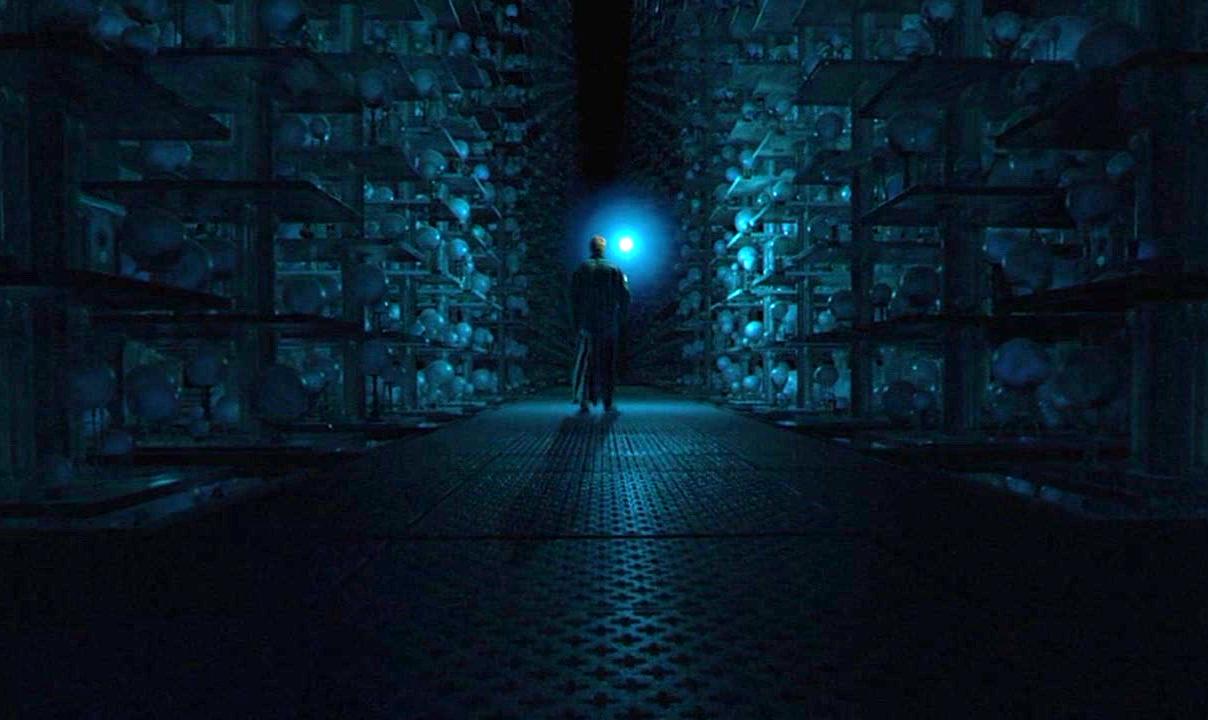
I feel that analyzing this scene will be extremely beneficial to me, as it will help me to get perspectives correct when I come to draw my own shelves. I also feel that it will help me to understand how to make my character move through a space such as this one. I also chose to look at this scene because of the atmosphere created within it. I really like how the scene is always almost in shadow and how there are only certain points of light throughout the setting. This has also given me a good idea of how the candles within my scene will light the space up and how this will effect the tone of my animation.

Subscribe to:
Comments (Atom)