Friday 31 October 2014

Illustrator Induction: Part 1


So Illustrator is SO MUCH BETTER than Photoshop. I mean look how smooth the lines are and whilst I'm all up for hand drawing my animations and I really enjoy drawing on the tablets and on paper, there's just some stuff where Photoshop just isn't going to cut it.
Despite me preaching that it's great and all I did find the programme a little confusing. To try get used to the controls a bit and get to grips with how to work the pen tool properly we were given a task sheet from which we had to follow the instructions in order to "trace" the image underneath.
I found the tasks really easy to complete, yet I'm not actually too sure what I've done or what the controls do but I think with practice it'll become easier.


In the second part of the induction we looked at how to use the varying stroke settings and brush tools. Whilst I really like the effect that some of the brush strokes created and how I could manipulate the spacing and dashing between the strokes, I still felt like I had little control over the style of the brush designs, meaning it wouldn't be original or unique. For this reason I prefer Photoshop for brushes and stroke styles.


Thursday 30 October 2014

Pose to Pose: Pendulum

In Monday's lesson we explored the final process of our explore brief,  pose to pose animation. This is when the key frames of the animation are planned out and drawn before anything else and then the in-betweens are put in afterwards. In order to experiment with this process we were told to animate a pendulum.

Personally I found this animation process a lot easier than straight ahead animation as I found that my spacing and timing were off when I was creating my flip books. I found that by planning out the key frames and filling in the in-betweens afterwards I was to create a smoother, better timed animated sequence. Plus, truthfully, I enjoyed planning out the animation just as much as I did creating it and watching it come to life.


Photography Skills

In our photography induction last week we were given a small brief in which we had to photograph a personal item to demonstrate our knowledge of a DSLR. Whilst we explored the settings and how to work them properly in our induction, we weren't given the chance to photograph something using continuous lighting. So to begin with I had to set up my own set and backdrop for my chosen item (a teddy otter/weasel) and then I had to set up my own lighting equipment and so forth. Once I had set everything up, which took its time by the way, I had to set my camera to MANUAL and adjust all the settings accordingly. 

So to start with I decided to tackle demonstrating depth of field as I felt that this was the one that required more effort on my part, as it was something I'd never really had to consider before. If I'm going to be honest I found this really difficult at first because the camera was an older version than the one I learnt the settings on and it took me a while to adjust to the seemingly complicated layout of the camera. Secondly it was extremely difficult to achieve a shallow depth of field as the camera lens didn't particularly focus on anything and the view finder was always blurry despite how much I concentrated on focusing the camera. In the end I manged to get a few shots demonstrating depth of field but with great difficulty but its taught me to get an easier camera to use next time I need one.

Shallow Depth of Field
Deep Depth of Field

So after that I moved on to shutter speeds and again I really struggled with this but by this point I just started to think that maybe I was just really rubbish with digital cameras and excepted the fact that it was going to be hard. In particular I really struggled with slow shutter speed, as I couldn't get the lighting right it was either too bright or too dark. However I do feel that I managed to get some really good examples of motion in action shots.

Slow Shutter Speed
Fast Shutter Speed


Finally, (because I've waffled enough) throughout the whole exercise I continuously experimented with the continuous lighting and creating contrast within my photos, which I feel I did really well. For instance, I experimented with turning one light off in order to create more contrast within the shot and I also experimented with using the large reflective sheets to dampen that contrast withing the image.


Lighting softened with reflective board

Lit from one side


Overall I've learnt a great deal about photography that I'm sure I will find very helpful in the near future.

Photography Induction: Getting to grips with a DSLR

In last weeks photography induction we looked at how to work a DSLR camera and how to use the manual setting in order to use the caemra to its full potential. After sitting through pointers and tips and getting to grips with what certain controls did and how to adjust the camera to my desired needs, I was given the task of going out and experimenting with different shutter speeds and aperture settings.

To begin with I took a variety of images using different white balances to see how this would effect the tone and colour of the image.


I then experimented with adjusting the APERTURE to manipulate the depth of field (in simple terms this means adjusting the focus so the picture is either blurry in the background or clear). By using a LOW aperture number I was able to create an image that had a shallow depth a field, like so:


However, when using a low aperture setting I had to think about how this would effect the lighting, as the lens would allow more light through because the lens is wider (can't think of a better word, sorry). This meant that I had to adjust the ISO setting as well as the shutter speed (ISO determines the grain of the image and how much light is in the image a low ISO means little light and a high ISO means more light but also more grain on the image). 


After to successfully demonstrating my understanding of depth of field and how to adjust the aperture settings and such I moved on to experiment with shutter speed. This also involved adjusting the lighting and ISO, as the shutter of the camera would be open either for a longer period of time or for a shorter period. At first this was very difficult to get right as I struggled to get the balance of light right. However, I finally managed to get the hang of it and produced these images.
Overall, I found the session really helpful and I feel that I'll be able to use the knowledge I've gained within my future work, particularly if I experiment with stop motion animation.

Wednesday 29 October 2014

Storyboard References: Up and For the Birds

January of this year I was really fortunate to be able to go to the Pixar exhibition that was taking place in Paris (I was so lucky to see it, as it was the last stop in the tour and was only there for a couple of months). The experience of seeing all those original drawings was amazing and to keep the memories I bought the catalog (it's all in French so I can't understand a word of it). In this book it has snippets of storyboards from the film Up and the Pixar short For the Birds. 


I really like the simplicity of this storyboard and the quickly drawn sketches. In particular I love how the expressions of the birds have been captured within the drawings and how they have been exaggerated. 


Similarly to the For the Birds storyboard, the Up storyboard is quite sketchy in style however, I feel that the storyboard for Up is a lot more detailed and a lot more sophisticated in the sense that the storyline is explored in more depth, which is expected due to Up being a feature length film and For the Birds being an animation shot.

I like both these storyboards for different and similar reasons but I think that I am more for the Up storyboard, as I really like the use of colour within the frames and the shots used within the storyboard. Having said that I do feel like the storyboard could use some camera directions and annotations to make it a little clearer.

Tuesday 28 October 2014

Storyboard References: Wallace and Gromit


The storyboards for Wallace and Gromit appear, visually, a lot different from the other storyboards I ave looked at. In a way they look a lot cleaner in terms of the lines and the backgrounds of the frames are a lot less sketchy and are drawn clearer. Although I like the sketchy looking frames from previous storyboards, thinking on a professional level I feel that it would be a good idea to clean up the final storyboards and make them look a lot cleaner similarly to the Nick Park's storyboards. 


I also really like how the dialogue of the character is written underneath the frame in which the character would speak. Again I feel it is all about clarity and coherence of the storyboard. Despite having said that I really like how the storyboards are very clear and clean, whilst I feel from a professional point of view these are very good, I feel that they lack personality and they don't capture the movement of the characters unlike the initial sketch in the image below. For instance I feel that the four frames below tell the story a lot better than the storyboard above, as it provides more depth and movement within the frames whereas the cleaner, clearer storyboards appear to be more flat and lack depth. Also it is simply a lot more interesting to look at and a lot more aesthetically pleasing.


Storyboard References: The Nightmare Before Christmas


So, personally I feel that Tim Burton's Nightmare Before Christmas is a wonderfully created piece of stop motion animation. Yes it's stop motion, it's sometimes hard to remember that with how amazing the film is. But that's not the reason I decided to look at the storyboards. For starters I love the range and depth of tone used within the thumbnail sketches, I feel that they really portray that sense of a dark atmosphere that Burton's work occupies. I also really like the detail in the characters and the frames all together, as they really help to make it clear what the scene should look like. This is something I should definitely look at but maybe only in important scenes or frames, as it would take me too long to put that amount of detail into every frames because I draw quite slow. 


 Another thing I really like about these storyboards is the use of camera directions. For the past two storyboards there hasn't been camera directions and I've felt like that has worked and that the camera directions weren't exactly necessary. However, although these storyboards tell the story very clearly I still feel that the camera directions are really useful, which has altered my view on using them even when you think they aren't needed. Having said this they aren't used in every frame so what I need to take from this is that only a select few frames need them if the rest of the frames are detailed enough.


Not only do I find Burton's drawing style beautifully strange and inspiring, but I also really love the sketchy style of these storyboards. Drawing quickly and in a rough style is something that I am struggling with when creating my storyboards and I feel that by adopting the loose lines that these storyboards use I might find it a little easier and become more comfortable with imperfect drawings. In particular I love the subtle colour use in the frame above, I feel that it makes this frame stand out from the rest and as I've mentioned in other storyboard posts, this could be a really useful technique when I have a large storyboard and I want to pick out the more important frames, as I feel that the colour helps to communicate the frame better.

Overall, I feel that these are a really good example of variation within a storyboard and the use of colours and tones. I also feel that they use camera directions effectively but not excessively, which is something I'd like to seriously consider when I create my next storyboard.  

Sunday 26 October 2014

Pixilation: Result


So this is the end result of my Pixilation brief. I feel that this Pixilation was very successful in terms of it portraying the relationship between host and parasite. I feel that I was able to clearly express my ideas for the animation in order for my actors to play out my visual desires.However, although it was my first attempt and I am really pleased with the results I feel that there is large room for improvement and there are many things I would consider if I were to create this again, such lighting, extra frames to make the story clearer and better time management. Having said this I had a lot of fun creating this animation and I feel that I would like to try this technique again at some point.

Pixilation: Ideas

After considering the three relationships we had to choose from and still not being able to come up with squat I decided to mind map each relationship, research each words definition and then see where my ideas went from there. This is a technique I have used since A-Level and I find that it works best for me as it allows me to gain an understanding of the context of the work and what I should aim to be conveying within my work.
Mind map for Predator - Prey
Mind map for Host - Parasite
Mind map for Parent - Child

After researching the words I found that I had managed to generate more ideas for Predator - Prey and Host - Parasite than I did for Parent - Child. I found the last relationship really difficult to create ideas for, as I couldn't think beyond the bond between a parent and child. So I focused on the first two relationship found that my strongest idea lay among Host - Parasite so I decided to storyboard that idea and see how my initial ideas would look.
Apologies for the poor quality


Reflecting upon my inital storyboard I added only one more frame for improvement and decided to go straight into testing and shooting my Pixilation because at this point I was running short on time (was really poor with my time management this time. Oops).

Pixilation

On Monday we were introduced to Pixilation and were set a little brief in order to explore this technique. Pixilation is form of stop motion animation which uses live actors to create the animation. It involves the actors moving ever so slightly for each shot in order to achieve motion.

Through the lesson we were shown a bunch of European Pixilation animations, which I found to be extremely strange and weird yet fascinating at the same time. I found that these animations were very "eye opening" for me as the only animation I have ever really experienced are quite contemporary and mainstream despite the fact that I have researched animators such as The Quay Brothers. It was nice to see that animations don't have to be mainstream but more about personal taste however, it did occur to me that not everyone will like such animations, as I certainly found the majority of them weird and some even a little uncomfortable to watch.

So for our brief we had to pick ONE out of three relationships to be the base of our ideas. These were:
  • Predator - Prey
  • Host - Parasite
  • Parent - Child
At first glance I had no idea what I wanted to do or how to go about it at all so I sat down and watched a bunch of Pixilation videos in the hopes that it would kick start any ideas.

Tuesday 21 October 2014

Photoshop Induction One


A part of animation is knowing how to use certain programs and software to create characters, environments, adding tweaks, etc. Although I already have a large basic understanding of how to use Photoshop, I had an induction into how to effectively use the program. I went over things I already knew such as how to create a new page or a new layer, as well as how to use tools for blending such as the eraser, which I never thought could be used to blend images together. However, by adjusting the characteristics of the tool I found that it effectively blended more than one image together and made it look realistic. Not only did I learn how to use the eraser but I also realised that the tools and techniques I learner about were a lot easier and more effective than the way I had been doing it previously. I experimented with this in the photo above and was really pleased with myself for being able to blend the images together to make them look realistic.


In the second half of the induction we learnt how to blend more than two images together using layer masks and adjustment layers. This was something I had never heard about and had never been able to figure out for myself despite having seen others use this technique. We were given a new task to show off the skills we had learned in the morning. So taking the base image from the morning session I decided I wanted to create a storm scene and experiment more with lighting. I feel that this was extremely successful as I managed to create a darkened atmosphere and blend the storm cloud in really well. However, when adding the figure I was slightly rushed and I feel that if I were to do it again I'd focus upon creating the right shadow on the figure.

Overall this session was really helpful and I think i did a PRETTY GOOD JOB at making some interesting images. I'm excited to see what else I can put together.


I posted this on the wrong blog so here it is again...

Monday 20 October 2014

Storyboard References: Wall.E

Okay, so yes I'm looking at Disney Pixar, again, I know. But in my defence Wall.E is an amazingly created film. They made the majority of the film with next to NO DIALOGUE! And you still fully understand the characters despite them not even being human. It's all the expressions (I'll ramble about this in the appropriate blog). Anyway because I'm such a big fan and I'm obsessed with this film just as much as I am with Brave, I really wanted to share the storyboards with you all because they are just beautiful.


For a start I really love the way the artists have used colour on specific aspects of the storyboard in order to point out that that part is important. I also feel that by doing this it helps to tell the story a little better, as you can see exactly what is going on within the scene. It helps to draw attention to the characters behaviour too, making it clear about the character is expected to do. This is definitely something I should try the next time I create a storyboard rather than using full colour, as it may make the action within that scene a lot clearer for others to see. 


Secondly, I just love the detail put into some of these drawings. They are so BEAUTIFUL. Just by looking at the drawings I fall in love with the character of Wall.E because they manage to capture his personality through one drawing by using exaggerated expressions. Again there is only selective parts that are coloured and again I feel that is to draw attention to those areas of the drawing and to make it clear that those parts are important. Maybe this is something I should consider if I ever do a detailed storyboard, as it will give whoever is reading from it an idea of the mood of the scene and the mood of the character.


Thirdly, I love the energy the storyboard has, the way it captures the movement. This has meant that camera directions are very rarely used within the storyboard drawings, which is another thing I really like because it makes the storyboards a piece of work in their own right. There is so much life and energy within these storyboards that I feel it tells the story so clearly and wonderfully. They paint a very clear path for someone to follow, as well as giving them a clear sense of the characters personality, which I feel is very hard to achieve, as a storyboard usually focuses upon the events of the story rather than the characters. Last point, I also really love the range of media used within these storyboards, they aren't all pencil or charcoal, they are a wide and varying mix, which I also feel I should explore and experiment with.
Overall, these storyboards aren't just beautifully developed and tell the story in a clear yet awe inspiring way, but they have made me realise that they are extremely important in terms of getting your ideas across to someone else and it is important that they tell the story as closely as you vision it. I really hope one day that I can create a storyboard anywhere near as good as this because put simply. THIS. IS. AMAZING.

Tuesday 14 October 2014

Bouncy, bouncy...

So yesterday I made my FIRST EVER WORKING flip book (just take a moment to celebrate that fact). Okay so I was only making a ball bounce up and down and later on in the afternoon around the page, but still, it was an achievement nevertheless.

Before, I started to create my flip book we went through the 12 principals of animation that were created by Frank Thomas and Ollie Johnston, members of an early Disney animation team (no surprise there…). They go through the key fundamentals of what to consider when creating an animation, which I found extremely useful. Although we learnt about all 12 principals, the task yesterday focused upon only 8 of these principals (thinking about it that's actually quite a few considering we were only animating a ball). The most important I focused upon were, squash and stretch, timing and ease-out and ease-in.

By using SQUASH and STRETCH I was able to give the illusion of weight and volume to my work, which made my flip book a lot more effective than if I'd have just made my ball touch the line and move back up the page. Also, using this principal gave my ball a lot more fluidity and made the flip book more interesting to watch.
Surprisingly enough though it was really difficult to keep the volume of the ball constant throughout the frames, especially when it came to stretching and squashing the ball.

Stretch
Squash


Moving on…

The TIMING of the whole flip book was extremely important in making it a successful animation too. The spacing of each drawing had to be correct otherwise the fall would either look too slow or too fast. This, at first, seemed like it was challenging however, after getting my head around the idea that drawings closer together slowed down an action and drawings further apart sped up the action I found that it was quite easy to space the drawings out or clump them together where necessary (I never said I did it perfectly though). Again, once I got a handle on the timing I found that it made my flip book a lot more successful and made it run smoothly.

Similarly to timing, EASE-OUT and EASE-IN focus upon the amount of drawings at the start and end of an action. As an action begins there will be more drawings, few in the middle and more at the end. By using this principal it makes the transition from stand still to action a lot smoother and easier to follow.

Poor quality, rough sketch of timing and easing-out and easing-in.

Okay, for the second flip book (the ball bouncing around the page) we focused upon the previous principals as well as the principal of ARCS. All actions (with the exception of mechanical ones) follow an arc or circular path, this includes a bouncing ball. I found that, by applying this principal, my flip book flowed really well and the action appeared more natural.

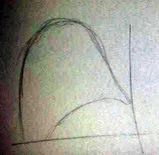
Again, a very poor quality sketch of arc path ball will take.

We also looked at the principal of ANTICIPATION. This communicates what's going to happen and is preparation for action. In other words it is a small, slower movement or action that a character or object makes before a major action, which will most likely be faster. for my task the anticipation of the ball looks the exact same as stretching and squashing just in a different order. The ball would squash before stretching.

Now to move on with adding 'character' to the ball...


I feel that the adding character element of the task went well however, I do need to work on my overlapping a bit more. Good result for a first attempt though.


Storyboard References: Brave

Not only did I choose to look at the storyboards of Disney Pixar's Brave because I'm totally obsessed with the film, but also because I feel that they so beautifully tell the story through the storyboards alone. I really like how the attention of each thumbnail is on the action of the character rather than the detail in the background. Whilst there's an indication of what the background should contain and what not, it lacks detail so as to give the main action the dominant position within the sketch. This allows for a great deal of clarity and understanding and is definitely something I want to try and use next time I make a storyboard.

Not only is the drawing style and technique very clear but the way each frame is drawn is also extremely clear, so clear in fact that camera directions aren't even used. This is also something I really want to try particularly in more detailed scenes, as it means I'd be able to get more detail in the action of the character without having to put arrows everywhere. I also really like the use of colour in the second example. I feel that it helps to portray that, that particular shot is a close up of Merida's face and it also draws the attention to Merida in this scene, which I think is necessary as there is another character in the background (I could be totally wrong though). I also really like the way the frames are shaded and the way they jump between colour, marker and simply pencil. I feel that switching materials within a storyboard could help point out the extremely important shots from the plain important ones and make it easier to read particularly in a long, detailed storyboard.


Another thing I really like about the storyboards of Brave is the digitally rendered (is rendered the right word here?) versions. Again, I love the shading within these frames and the way that the lines have been used to draw attention away from the background and to the characters instead. This has made me think about rendering my storyboards in various other materials and techniques to see how each one effects how the story is told. It has also reminded me that the same effects can be achieved through more than one material.


Overall, although I am quite biased towards this work (because the film is just amazing), I chose this series of storyboards of Brave simply because I think they are a great example of a storyboard. They contain various camera angles and shots and they tell the story in such a clear yet detailed way.