Now that the stop motion video was complete, I was able to help Molly and Katy with the remaining 3 videos. I can happily say that there wasn't much left to do, as they had been busy working on it whilst I was editing the stop motion.
Katy was working on the 'Crowd' video and Molly had taken the 'Dance' video, which left the 'Book' video, so I decided to take this and work on the first 4-5 seconds whilst I waited for the animated clips from Katy and Molly. Sticking to the theme of fun and 'wacky', I stuck to simple line work and patterns like the others had and I feel that I managed to replicate what the other two had created.
Once the others had finished, Molly took the the last of the 'Book' video and Katy worked on the description, title and statement for our submission. I began the process of post production once more to add in the floating patterns that Katy and Molly had designed and prepped earlier in the project. The idea was to have the GIFs masked out and floating in the background of the videos.
Making out the pattern
Adding the masks to the footage
It was a simple process of masking and key framing, which took no time at all and I had no difficulty with the process. I then attempted to add them to the footage, however, I wasn't too sure whether the floating blobs fit properly with the rest of the animation, so I asked the others what they thought. They seemed to really like it and didn't suggest that I remove them, so I decided to stick to it, as the others felt that it looked good and agreed to have the blobs in the final footage.
Overall, I'm pleased with the final outcome and I feel that we are in a strong position to submit.
As Katy and Molly began production on the edited footage, I got to work on the post production of the stop motion. As I mentioned before, the levels of the frames are off due to us not taking more care when setting up our equipment, meaning I had a lot of work to do before I could say it was finished.
Mike had suggested that I edit the levels frame by frame in Photoshop, which I did however I couldn't achieve the consistency that we wanted through this method. I also found that it was extremely time consuming, which is something that we couldn't really afford as the deadline was only 3 weeks away at this point. I was also struggling with the file size due to there being so many frames.
This led me to attempt to fix the issue in After Effects, as this would give me the ability to alter them frame by frame. Although I had to alter the levels frame by frame and key frame almost every frame, I found that I was able to achieve much more consistency than when I attempted it in Photoshop, it was also a lot less time consuming. Having said this, there was still a flickering of colour however, it wasn't as noticeable. If I had more time I would have put a lot more time into making the levels as consistent as possible. Despite this however, I feel that the levels have turned out quite well considering there were some huge level jumps on certain frames.
Adjusting Levels in After Effects
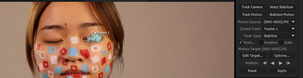
In terms of attempting to fix the jumpiness of our footage, I tried out the motion stabiliser in After Effects to see how this would effect the footage. This was something that I had never used before so I didn't know what to expect from using it. A lot of this was done by experimenting, as i was new to it, but I found that the motion tracker worked better when placed on an area of the footage that had high contrast so I tried to focus on these areas when I was placing the tracking points.
Position of Motion Tracker
Position of Motion Tracker
As the footage was separated into 5 different clips I had to place the trackers in different places to achieve the best possible outcome. After I'd done this to the first clip I played the footage back and showed Katy and Molly, as I was struggling to see much of a difference between the two as I had been staring at it for quite a while. Although the motion track stabilised the jumpiness slightly, it didn't have all that much of an effect on the overall footage. However, I felt this had something to do with where I was placing the trackers, so I attempted it again but with the trackers in different places. This seemed to work a lot better, so I used the motion stabiliser on the remaining footage too.
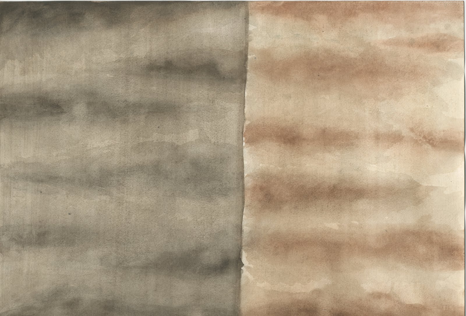
Footage before Motion Stabiliser
Footage after Motion Stabiliser
Once all of the clips were done and I had edited them together I watched it through and decided that it would be worth altering the position of some of the frames that weren't stabilised enough with the trackers. This was a simple task of key framing the position of the frames where I felt it was necessary.
Altering position key frames
The overall effect seems to work in our favour and I feel that I have managed to fix the issues we had with the footage to a high enough standard to use for our submission. I also feel that I have learnt a lot in terms of how deal with footage that isn't 'perfect' and I have improved on my post production skills. However, this isn't to say that I realise the importance of getting the footage as 'perfect' as possible whilst shooting, as it makes it easier to work with in post production.
To complete the video, I put the footage to a soundtrack in Premiere and also added the Dazed Media logo. We are happy with how this turned out and glad that I was able to edit the footage we had to create something that would fit with the rest of our footage and with our ideas.
On Thursday, we sat down as a group and discussed our options for music. Whilst I had been working on editing the footage, Molly had gone away and sent out a Tumblr post to recruit someone who was willing to allow us to use their music for our videos. Molly had received a really positive turnout and we had a wide selection to choose from. However, we decided that we wanted to use music from the same artist, as this would allow for some consistency and would also make things like getting permission and payment if the artist, respectfully, wanted to be paid for the music a lot easier.
After listening to some of the artists that had caught our interest we finally settled on Vinnie Neuberg. We felt that his music fit well with the Dazed Media brand and our ideas. We wanted a kind of 'retro' vibe, which we felt Vinnie's work definitely had. We also felt that his work had a nice pace and would fit nicely with our footage.
After confirming it was okay to use his music through email, he very kindly gave us the album we were interested in for free and gave us freedom over which tracks we used.
Overall, I feel that we have music that is appropriate for our ideas, that fits well with the overall theme of the project.
Whilst Katy and Molly were busy designing the patterns to be animated for the footage, I was in charge of editing the footage together. I wanted to edit the footage together in a way that would portray the idea of fun whilst reflecting the aesthetic of Dazed. This led me to focus more on the footage that was slightly 'odd' or looked deliberately like we were messing around, as I felt that this would be the best way to convey our ideas and achieve what we wanted.
Using Premiere, I started with the 'Crowd' video and looked for clips that I felt fit in with our ideas. I actually found it quite difficult to choose from what we had, as we had a lot of good footage and it was difficult to select which clips worked the best together. In the end I went with what I thought looked best together and with what I believed achieved our goals visually.
The 'Crowd' Video
I had an easier time with the 'Reading' video, as this video is going to be focusing more on the animation. This meant that we didn't necessarily want too many variations in shot, nor did we want there to be too much movement, as this would distract from the actual animation. So I made the decision to only use three different camera shots, feeling that this would give us enough variety but allow us to focus on the animation instead.
The 'Book' Video
For the dancing video we had originally had the idea to edit the footage to change on the beat of the music. However, we had looked at a few examples of music that we wanted and I realised that they didn't really have much of a beat to them so it wasn't particularly necessary to edit the video to the music. This also made it easier for me to get the footage edited together on time, as we haven't settled on any music at this stage.
The 'Dance' Video
Overall, my group and I are happy with the edited footage and feel that it fits in nicely with the aesthetic of Dazed Media whilst portraying our ideas for the brief.
For one our four videos, we had decided to create a stop motion animation onto someone's face, this someone being Wing who very kindly agreed to be our model. The idea came from looking at Hattie Stewart's work and we thought that it would fit in with our idea of creating something fun and 'wacky' to demonstrate creative independence.
We had agreed to keep the theme of shapes and patterns running within this video and came up with the idea of using simple shapes, such as squares or circles and painting them in sequence onto Wing's face.
Molly Animating
Although the process was very straight forward and we didn't have any issues whilst shooting, it did take us the best part of 6 hours (not that we didn't expect it to take that long). We started off with the smaller patterns and animated them before moving on to the full face paint. Personally, I feel that the whole process went really smoothly, apart from someone occasionally knocking the tripod (I sat with it after the third time and made sure that it didn't move any more).
Katy Animating
Although we managed to animate this part quite easily, we did encounter some problems with the finished footage. To start, we didn't set the camera up for wide screen, so all of the shots weren't 16:9 format, however, this can be fixed really easy as we allowed room for cropping in the shots, so this isn't a major issue and can be fixed really easily in post. Another issue is that we seated Wing on a moving chair, we didn't feel that we had much of a choice, as we couldn't expect her to sit on a hard chair for 6 hours, and this was a compromise we made so she would be as comfortable as possible. I can attempt to fix the jumpiness in After Effects using the motion stabilizer setting in an attempt to make the footage a little smoother. However, the biggest issue that we had was that we had forgotten to take off the auto white balance. This has resulted in the levels being different in every shot, which detracts from the animation as a whole. In order to stabilize this, I will have to attempt to alter the levels for each frame, Mike suggested that I do each fame individually in Photoshop. This might be the case, however I feel that it may be more time efficient to attempt to key frame the levels in After Effects.
I will attempt both of these methods to see which produces the best results.
Despite the issues that we have encountered, which I feel were due to us not being as organised as a group as we were for the other shoot, w have managed to get a lot of footage that I can use to cut together to create our final video. I'm confident that I will be able to adjust the footage in post to create something of a similar quality to our other videos. If we had more time I would have asked to redo the whole thing, but we are quite short on time and I feel that it would also be a little unfair to Wing to make her sit there for another 6 hours. It has however taught me to double check that our equipment is set up properly before starting work to avoid as many complications/ issues as possible.
Molly, Katy and I had originally planned to shoot all of our footage in one of the photography studios because we believed that this would give us a lot more control over who was in the shot, not having to wait for the public to walk past before shooting, etc. However, when we went to see Matt in AV, he brought it to our attention that it would most probably be more time efficient and less stressful to go outside and shoot, as we wouldn't have to wait for a studio to be free and we wouldn't be on such a tight time slot. After discussing this, we decided that this would be a better option, as we wanted to take quite a few different shots and experiment a little with different situations.
Matt also kindly pointed out that we should aim to shoot everything in the same location to save time and to give all of our work consistency (the only thing we couldn't shoot outside was our stop motion). Again, we discussed this as a group and sat down to come up with a few thumbnail sketches of our initial ideas of what we wanted to achieve during this shoot. We decided that we wanted to have a section in each video where we could place the Dazed logo over the footage but still see what was going on, so Molly suggested that we have a few wide shots that come in at the end so we could place the logo above the people.
On Scene
The shoot went really well, we had no difficulty getting there and Burley Park itself was relatively empty so we didn't have any issues of people walking onto shot. At this point we had also gained the help of Mel to do our dancing scene for us and we are really happy with what we have for that video. Everyone was very co-operative and I feel that our time was used very effectively and that we, as a group, were very well organised. Overall, it was a great experience and I enjoyed being outside for a change, we gathered lots of relevant footage and I now have to edit it all together whilst Molly and Katy continue to work on pattern designs.
Katy and I sat down to go through what we had done since our last progress meeting. I also wanted to go through all of the look tests I had done in order to finalise textures and move on to production. In the last few weeks Katy has done a wonderful job of 'catching up', as she states (despite the fact that she wasn't that far behind me at all). She has managed to complete the final storyboard and produce Phonemes for the Boar and the Robin, which I was really pleased with and was glad to hear that she was half way through doing a lip sync test for her character (the Boar).
I then showed Katy everything I had done and she seemed really pleased with my Phoneme chart and I received really positive feedback from her on my lip sync test. I also received some positive feedback on my look tests, which made me feel a lot better, as I didn't know if they were working or not. We discussed which environments and characters we were most leaning towards and went through which aspects of the environments we liked the most.
Boar Texture Tests
Wolf Texture Tests
Wolf Texture Tests
For the Boar environment we preferred the lighter sky colour with the darker ground, as we felt that these both worked the best together, however, I still need to experiment with the trees in order to see if we want a mixture of shades to help create depth and try and make our environments look less flat. We were also leaning more towards the lighter coloured boars, as we felt that these would stand out more against the background, but this will also be dependent on where we position the character. In terms of the wolf character, we preferred the darker shade on the top of the character and the lighter on the bottom because it gave us a little diversity between our characters. We were also drawn to the more vibrant shade of green for the grass, as we felt that this matched the research we had done more and also helped to make the character the focus. However, we need to be careful that we don't make the environments too vibrant and distracting, as we want it all to work well together. We also felt that the darker sky worked well with this character because we wanted it to be set later in the day and we also wanted to make the scene foggy. Having said this however, we were a little concerned with the rock and felt that I should experiment with making it darker and removing some of the greenery to help distinguish it a little more.
In terms of the Robin, we felt that all of the different shades worked really well with both environments, but we had to consider which shade would work best with both the boar and the wolf character. We also wanted the colours to be different. as we didn't want all of the colours to look the same. However, this will take a little more experimenting to see which will work the best with both characters. As an after thought, I also suggested that we give the wolf and boar digitally coloured elements like we have done with the robin in order to make the characters all the same, so they all look like they belong.
Katy also brought up the changes she made to the Boar and what I think would make the character look more like the other two. I suggested that she look at getting rid of the eye lids and eyebrows and use her line work more to suggest features like eyebrows and such. She did this and the end result seemed to have a lot more appeal than her previous character and we are both happy with the end result, as we feel that all of the characters work well together and have the same style.
Overall I am pleased with what we have and feel that we are in a strong position to start focusing on production. However, I do realise that we are working quite slow and that we need to pick up the pace, as we only have two weeks until our interim crit.
To kick start production I have gone ahead and started to create a lip sync chart to refer to for the wolf character (Katy will be doing the Boar character, as this is the character she is animating). By doing this, I feel that it will help animating the speech a little easier because I will have the basic mouth shapes to refer to already, rather than having to animate from imagination or having a mirror with me everywhere I go. Using the reference I collected earlier in the week and using a mirror, I was able to come up with a range of different mouth shapes that I feel are a good starting point and from there I decided to draw those mouth shapes on a wolf's snout.
Phoneme Sheet
They aren't perfect, but they give me a good understanding of what kind of shapes I should be aiming for when I begin to animate my character. They also helped me a great deal when I conducted an animated lip sync test.
I found lip syncing to be quite fun if I'm going to be honest. It isn't something I've ever done before but I was really excited about trying something new and challenging myself. I was also really excited about animating again, as I feel that it has been a while since I've animated something this challenging. At first I found it a little difficult to match up the mouth shapes with the audio but I got there in the end and it didn't take me as long as I thought it would, but it did take quite a while to complete. However, with practice, I feel that I will be able to pick up the pace as we go through our animation.
I decided to animate to a clip from our animation, as I thought it would be relevant and give me enough practice. I started by planning out the key frames to match the text at the side of my animation, which helped me a lot and made it easier for me to match the mouth movements to the audio. When I began to animate (without audio) I felt that it went too quick, so I exported the small clip at 12 fps and placed it with the audio and I instantly realised that it was too slow. So I kept it at 24fps, but held some of the frames on the vowels to make the mouth sty in certain positions for longer.
Animation at 12fps
As I was animating and looking back through the clip I noticed that I had placed a mouth movement for the 'A' in 'humans' and I thought that it looked a little strange, but I couldn't be sure, so I exported the clip and put it with the audio to see how it fit.
I realised that the 'A' shape wasn't needed at all and removed it from the sequence. This made the mouth movements look a lot more natural and it looked a lot less confusing to watch too. I also feel that it matched the audio quite well and I was pleased with how it looked, which made me want to finish the sentence, so I did.
I'm really pleased with my first attempt at lip syncing. I feel that it matches the audio quite well and I've learnt a lot about re-using frames and animating efficiently. I've also learnt that you don't necessarily have to place in every single mouth movement but focus more on the sounds that create the syllables for that word and focus on those shapes instead. I've also noticed that it works really well if you 'pop' from one shape to the next and ease out of them rather than easing into them too.
It's not perfect and I feel that there is room for improvement, but I am confident that I have a good understanding of how it works to start production.
Now that I have the majority of our textures, I was able to get on with the look tests to see how we could use the textures for both the characters and the environments and experiment with how these textures work together. But first I had to create a digital version of Katy's characters. Whilst drawing out the characters, I realised that the wolf character was lacking something that I couldn't quite put my hand on and I felt that the character still appeared quite feline. I decided to experiment with changing the line work a little and making it look more 'furry'. Once I'd done this I also decided to change the eyes, as I felt like they looked too human and made the character look less frightening than what we wanted. After I'd made these changes I showed Katy and she was happy with the final result and said that she felt that the character had a lot more appeal now that I had made some adjustments. I also suggested that we change the Boar a little to make him more appealing by making his ears slightly larger and possibly changing the eyes. However, we haven't made any definitive decisions about this character yet so, for now, I worked with my sketch simply to test how it would look in the environment. I then did a character line up to determine size and to see how the characters worked together.
Character Line Up
Whilst I feel that the Wolf works with the Robin, I feel that the Boar is too realistic and makes the Robin appear more cartoon-y than the other characters. Katy also agreed and will work on refining the Boar character a little more. From here I began to add textures to the characters.
Boar Textures
Wolf Textures
Original Wolf Texture
Robin Textures
Looking over the different tests I did for the Boar I prefer the two lighter colours to the brighter one (2nd in) and the original (4th), simply because I feel that they will stand out more against the background and the facial expressions will also be clearer to see. I also think that that they are just generally more appealing. After showing them to Katy she also agreed that the lighter ones might work better, however, she also liked the brighter coloured one too (2nd one in). However, I don't agree with this choice and believe that it would blend in too much with the backdrop.
Reflecting upon the Wolf textures, I personally prefer the textures with the darker shade on top and the lighter on the bottom even thought the latter makes the facial features more noticeable. This may change once the character is placed in the environment however, so I am still going to test the different textures except for the first test, as the colours are too vivid and bright. At this moment I am leaning towards the original texture because I really like the colours and the way that they blend. I also like the appeal that the darker face gives to the character and I believe that it creates a sense of mystery and helps to imply that this character is dangerous.
In terms of the Robin character, I wanted to create colours that didn't match the Boar's or Wolf's but that also seemed quite natural. This proved a little harder than expected because the base colour was brown, just like the Boar's. After altering the textures I relaised that I much preferred the lighter colors I had created, which was the opposite of how I felt when Katy had done a lighter colour in her digital tests. However, seeing the textures in a lighter shade has changed my mind. I feel that the lighter shades give the character a lot more appeal and I am definitely drawn more towards the lighter tones characters. I also feel that the lighter tones will work better alongside both characters and the environments.
To test all of these ideas I placed the characters into the environments with all of the textures.
I experimented with adjusting the levels of the ground only, as I originally felt that the trees were a nice colour as they were. I gradually increased the darker slider whilst very slightly decreasing the lighter one to make the colours appear darker. I much prefer the darker shades to the ground because it highlights the textures more than the lighter and original textures. The trees also appear to blend in better with the darker textures. In terms of character texture, the lighter shades work quite well against the lighter trees and darker ground. However, the original texture (4th along) also seems to stand out against this background. I still don't feel that the brighter Boar works, as I feel that it contains too much contrast and doesn't fit into the environment very well.
I also tested how the darker floor and the boars would work against darker trees. Personally, I prefer the far trees in the darker tone, as it adds more depth to the environment. However, I'm not sure I like the darker foreground trees, as they draw attention away from the characters. However, I am going to discuss these thoughts with Katy first before I do any more tests to see how she feels about what I have done.
As before I experimented with all of the textures together. The original texture was too pale and didn't show much of the texture so I immediately changed the levels of texture to make it darker. I also adjusted the levels of the tree textures to make them darker too, as we were thinking of placing this character in a darker setting.
So I focused on making the texture appear darker and I also focused on making the colours the little brighter, as this is what we found when doing our research. Looking at the three tests I did, the first and the last stand out to me the most simply because I feel that they work really well with the all of the textures of the characters and the trees. However, the rock does seem to blend in with the ground a lot, so I will have to look at playing around with the levels of the rock texture to help it stand out a little better. Having said this however, I really like the deeper green in the second texture and think that it helps to make the characters texture stand out more, however it may also be too overpowering and draw attention away from the character.
With the darker ground textures, I wanted to experiment with how these, and the characters, looked with the paler trees. I feel that the lighter foreground trees work really well with the characters and don't draw as much attention away from the characters as the darker foreground trees. I also really like some of the paler background trees, but I also like the darker ones too. I'm having trouble deciding, I know. In terms of the ground however, I think I prefer the slightly paler texture when used with the paler foreground trees because they blend together better than the darker ground texture. I also feel that the original character texture works better with the lighter trees, but we can't make any decisions on this yet because we don't have a sky or fog texture yet.
Overall, I feel that I have explored the textures well enough and have come to the conclusion that the textures work well together if the background textures aren't too overwhelming to give the focus to the characters. Having paler foreground textures and darker background textures seems to help to create depth within the environment, however, I feel that I should experiment with adding different shades of the two textures to help create more depth. I also feel that I should experiment with them in After Effects to see how adding depth through 3D layers works.
I also need to add in a sky texture for both environments and experiment with different methods for the fog in the wolf environment. During our next progress meeting, I will show Katy what I have done with the environments and see what she thinks about them and take my experimentation from there. I also didn't get around to placing the Robin into any of the environments yet and will need to do this before our next progress meeting.
Earlier this week I asked Katy to work on producing some final textures so I could get on with creating a look test and move on to production. Katy managed to get most of the textures done quite quickly and I was grateful for her enthusiasm, as it meant that I could start to test how we were going to use our textures. Having said this however, Katy did forget to do the final textures for the floor and the sky, so I offered to do them for her whilst she focused on something else (I also forgot about the sky and the fog and will have to add them in at a later date). For now this is what we have in terms of final textures.
Texture for Boar trees
Texture for Wolf trees
Texture for rocks
Boar environment texture
Wolf environment texture
Robin texture
Wolf and Boar textures
Alternative Wolf texture
Although these are the final textures, I want to experiment with the levels and saturation in Photoshop to see how they all match up together. I also want to experiment with the two different Wolf textures and find which one best suits our needs and the environments. Overall, I'm pleased with the textures that we have and I will start to test them later this week.
So a few weeks ago I sent over some environment sketches to Katy to encourage her to start thinking about environment design and begin focusing on those rather than giving all of her attention to the characters (we can't have characters without environments). However, this didn't have the desired effect and although I'd pushed her to start the environments Katy just never seemed to get around to doing them. This means that my sketches were the only experimenting we had done in terms of environment design and whilst I was okay with using similar environments to what I had done, I do feel that there was a huge lack of experimentation and that maybe they weren't explored as much as they could have been. On top of this, there's been no real experimentation with camera angles, meaning we will have to draw environments up as we go if we decide to change the camera angle.
Boar Environment Concept
Wolf Environment Concept
Wolf Environment Concept
I was really disappointed that Katy hadn't been able to do any sketches for the environments and I wasn't aware of why she hadn't gotten round to them either. Assuming because it was too big a work load, I asked if she needed help, which she turned down, so there wasn't much I could do other than keep trying to encourage her to keep going however, this doesn't seem to have any effect on her work flow. I decided to give her a deadline for the final environment designs use my sketches as reference if she needed them.
Katy's Boar Environment Design
Katy's Wolf Environment Design
Katy's Wolf Environment Design
Although Katy hadn't experimented with any environment sketches, I feel that we have environments we can work with, however, they are just neater sketches of what I had drawn. I pointed this out to Katy and said that we haven't done enough experimentation into the environments, however she didn't really respond and moved on to other aspects of the project. For now these environments will do as a base to conduct look tests and to use as the main environments.
Overall, I'm unhappy with the development on the design side of things simply because we have minimal environments to work with and the enthusiasm that was there for characters isn't there for environments. This has led to communication between us to fade, which is having a negative impact on work flow. We need to get back on track with our schedule and make more of an effort to keep in touch with each other about our work and to communicate what we are thinking better.
In order to help me with getting to grips with this whole lip syncing business (because it's difficult, really difficult) I decided to sit down and watch a range clips from multiple animations that have talking animals in them. which turned out to help. A lot.
To start with I focused on animations that had dogs, wolves, foxes, etc, as our wolf character would be doing he majority of the talking in our animation. Plus the wolf is my main character throughout production, so I felt it was appropriate to start here. I started off with All Dogs go to Heaven, both one and two. There's a lot of singing within these two films and it allowed me to watch how their mouths moved to lots of speech with ease. I noticed that their mouths focus on forming the vowels and the shape of the syllables rather than trying to form the whole word. Despite the worked not being fully formed it was still really effective and the mouth shapes still represented the word being spoken.
Facial Expressions of Charlie from All Dogs go to Heaven
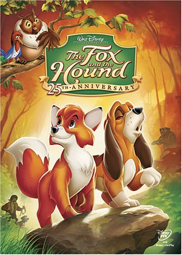
I found that it was quite similar in The Fox and The Hound, however, their mouths seemed to have a lot more movement, which made it flow with a lot more fluidity and made the words run into one another a lot cleaner. In fact I found this to be the case with all of the Disney films that I looked at including, Oliver and Company and The Lion King.
The Fox and The Hound
I completed my research by watching Balto all the way through, just to get a full understanding of how the animals mouths were animated by a range of different companies. I found Balto particularly helpful, as the main character is a wolf, giving me a very good reference point to work from.
Clip from Balto
I also did the same for the other two characters and looked at films such as, The Lion King (for Pumba), Babe, Charlotte's Web, Animal Farm, and Creature Comforts. All of these animations are really good examples of how lip syncing has been done successfully. What I have noticed across all of them is that emphasis is placed on either the vowel of the word or the syllables rather than the pronunciation of each letter. This is something I will definitely stick to when I come to animate my own characters talking. I've also noticed that a lot of the mouth movements are exaggerated, again something that I will keep in mind to practice when I come to do my own lip syncing. I feel that I have a really good selection of reference points to look at and I feel that I would benefit from creating my Phoneme chart for each of the characters, so I will make this my next stepping stone.
Yesterday was crit day. Personally, I felt that it went quite well in terms of how much content we had and how far we had progressed with our work. However, I was disappointed that we didn't have any animation tests to show, nor had we managed to get a look test together. I was also really disappointed that Katy hadn't gotten around to any kind of environment design and felt that we would have received much better feedback if we would have had more concept work to show.
Presentation Slides
Presentation Slides
Despite this, I felt it went quite well, despite not receiving much feedback, the feedback we did received was all positive and there was a few points made that were constructive. The feedback primarily focused around praising us for our strong development and the amount of work we had already completed. However, I struggled to take this as a compliment because I am still worrying about our lack of environments and tests. This is something that our peers also picked up on and suggested that we try and get a look test completed as soon as possible to see how we are going to make all of our elements work together. They were intrigued to how we were going to make the characters stand out from the backgrounds and stressed on the importance of making them stand out, as the animation won't work if they all blend together.
Katy and I both agreed on this point and will work towards getting a look test done over the next few days.
We were also reminded to be careful with our textures and to make sure that we scan them in at a high resolution to help keep the texture and quality to a high standard. Overall, they seemed pleased with our character designs and out plans to move forward and they enjoyed our animatic. They did suggest we look at adding in subtitles to prevent confusion, as our characters have very distinctive accents and this is definitely something that I will look into, as I would like our animation to be understood by everyone watching and not just a select few.
Overall, I am happy with the feedback and feel that very important points were made, however, I'm not wholly pleased with our work flow at present. This has encouraged me to try and create a more productive work flow between Katy and I and to get the production ball rolling once again.
Earlier this week Katy and I scheduled a session to sit down and chat about how far we had got and what still had left to do in preparation for our pre-production crit on Monday. At the start of the week, I had encouraged Katy to look more at creating the environments for our animation, so I could move forward and begin to look at creating look tests, animation tests and so on. I had also asked her to create the final textures based on the ones we had chosen from our material testing, as I thought that it would be simple, as we had already created the textures so there was no need to experiment further. However, she had decided to begin work on a final storyboard instead and experiment more with textures on a larger scale. This has put us behind by a week and I was beginning to worry, as we still don't have any environments to work with or show. It is also making my part of the process quite difficult to complete, as I don't have all of the elements to work with.
With this in mind, I asked Katy if she was struggling and offered my help, which she turned down with a promise to work a little faster and have things completed by mid next week. Whilst she was doing this I suggested that I could possibly start to move forward and create some phoneme sheets that would aid us when animating, of the shapes each characters mouth would make when talking.
Although I feel Katy is falling behind a little, I also started to think that it may be due to me not communicating properly with her about where we should be at and what the plan is for the week. To try and solve this I made it clear that I wanted Katy to forget about the storyboard for now and have the environments and final textures done by the end of next week. I also asked if she understood what it is that she needed to do this week to make sure that I hadn't been confusing. She seemed clear on her tasks and I'm pleased that I had made things clearer for her.
Hopefully I have managed to encourage Katy to work a little quicker and not spend too much time on one task but rather keep the deadlines I set in mind and try her best to stick to them. As of now, I feel that it is safe to say I have adopted the role of producer and director and whilst I wanted us both to have a say in how things got done within this project, I feel that I have had to tell Katy which direction she needs to take next. I'd really like to encourage Katy to be more confident in her choices and I will do my best to do so throughout the remainder of the project.
Earlier this week I set about putting together the animatic from the thumbnails that Katy had created from my thumbnails to see how our sound and story worked together and to check that our animation fitted within the time restrictions.
Putting together an animatic to a pre-recorded clip was something that I had never actually done before, in fact I've never actually added sound to an animatic before, so I found that I had to pay a lot more attention to this task than previous times. Having said this, it did allow for me to gain a new appreciation for having an animatic and I actually enjoyed seeing our work come together.
My Thumbnails
My Thumbnails
Katy's Thumbnails
Katy's Thumbnails
In terms of content I'm quite happy with what we have so far and I feel that the story is clear and well paced. However, there are a few adjustments to make, such as adding in character movement to capture personality and changing a few camera angles, which I have told Katy about and she will make the amendments in the final storyboard. Creating the animatic to a pre-recorded track has allowed me to see how the dialogue works with the story and place in appropriate pauses for characters to respond to the events throughout the story, as well as pauses for gags/ jokes and overall I am pleased with how it all comes together. If I were to change anything, I feel that it may be beneficial to re-record some of Katy's dialogue because I feel that some of the questions sound lazy and as though the character is uninterested, which isn't the mood we want to create.
Whilst watching through the animatic, I noticed that the dialogue with the relevant pauses included runs very close to the time restriction and I have suggested to Katy that we could include some of the opening credits as the robin is asking the first question if we need to have that little extra time. We also need to think about background sounds and implement them into the final animatic.